DANKO Identity evolution
First conceived sometime in 2006, my professional brand and identity has evolved considerably over the last twelve years.
Let's start with the name: Danko is my last name. Since my teenage days as an Air Cadet within Hamilton's 150 Tiger Squadron, I've almost always been known simply as 'Danko'.
When I moved to Berlin in early 2014, I recognized the opportunity to make this identity permanent. I stopped introducing myself using my first name, began correcting people who did use it, and asked that they call me by my surname. Four years later, almost all who still address me by my first name are immediate family, located in Canada.
The visual representation of my professional identity has gone through a few major iterations, sometimes struggling to move forward and occasionally just plain fugly. I've kept nearly all of the design files over the years, building upon ideas and iterating a new version about once each year; the following is a collection of all variants, with examples where possible.
Enjoy!
2006
The Danko Identity design began during my time at Sheridan College in Oakville, Ontario, Canada while studying for my BA in Medical, Technical and Scientific Illustration.
Part of a printed promo, the first clear instance of the brand included my name in white, sans-serif grotesk characters, written in a free typeface called reznor broken, set upon blocks of indigo and tan in stark contrast to a heavily spaced portfolio of illustration and design work.
It was basic, ugly, spacey, dated and severely lacks adequate contrast.
2007
Later, I expanded upon this simple palette and used a stylized, cringeworthy, black-outlined unidentified script typeface to emphasize the website and name for a website and additional mailers. I'm not sure why I thought this was a good design decision, nor why I opted to add a period after my name.
Clearly, I was studying Illustration, not design.
2008
Two years later, I adjusted the sans-serif version to include pixel-like squares. Retaining the tan, white and indigo colour palette, I experimented with kerning and minimalism by tilting my name ten degrees and cutting much of the nine characters from the bottom, replacing it with my contact info for use on a resumé. I placed the website address within the space between the d and k, and reused the pixels as a design element for emphasis. Following the trend of the era, I used only lowercase title characters. Neat.
2009
Growing bored with this, a year later I tightened the tracking and adjusted my colour palette, replacing the tan with a bright Incredible Hulk green, and adding a Web 2.0 style inner glow to my first name.
I also moved the website address to sit above the m and a of my first name, allowing a larger typeface size, and made it 20% grey.
2010
The next year, I finally decided to isolate the indigo blue as an accent colour amongst deep black and white. I used an outer glow to add subtle emphasis on the website and eliminate unnecessary name repetition.
The vague "creative professional" subtitle was meant as an introduction to my work... as at that time I wasn't really sure if I was an Illustrator, Graphic or Web Designer.
2010 & 2011
Later that year, I introduced magenta as a secondary accent / web link colour. In 2011, I experimented with capitalization and began emphasizing my surname over my first, rotating the latter counterclockwise by ninety degrees and nestling it beside the former. (Ooooh, look, a QR code!!)
I finally replaced Reznor Broken with Helvetica Neue, tightened the tracking and kerned the hell out of the letters, merging the T's, the D and A, and experimenting with the limits of simplification versus legibility.
I also created and published an updated digital portfolio website using iWorks.
2012
This is when things begin to simplify and get interesting, moving toward a true, viable logo.
By 2012, I had finally eliminated the drop shadow and chose a thin sans-serif font to emphasize my 'title.' It was also around this time that I began using the term 'Creative Monster.'
Looking back on this design, I find this squished version anxiously claustrophobic. The merging of the character thickness is clean, but the proximity is... extreme. The hairline proximity of the K and O further exacerbate this (but I kinda like the NK combo).
2013
This DANKO brand treatment and four-colour palette remained for a while, until I eventually dropped the pink and stuck with black, white and the definitive bright cyan blue.
This is also the year I first began to simplify things as far as possible, reverting DANKO to a singular D, and removing the whitespace within it. Used as a secondary treatment only, this solid D shape grew on me and I carefully padded it with substantial white space.
I experimented with business card and stationery ideas. Initial designs were basic dimensions, others used a die-cut D shape contrasted by a full-bleed selection of my illustration work.
Final business card prints used UV ink to achieve a refined black-on-black logo effect.
2014
After moving from Toronto to Berlin in early 2014, I stopped using my first name entirely, and in an attempt to assimilate into German society, began adding an umlaut to my last name in professional instances. I even went so far as to include it on my business cards.
After replacing Helvetica Neue with Museo Sans as my standard typeface, I set wide tracking and gave into the dark side: I built myself a new portfolio site using Squarespace, opting for a dark theme focused on black and opaque overlays.
LATE 2014
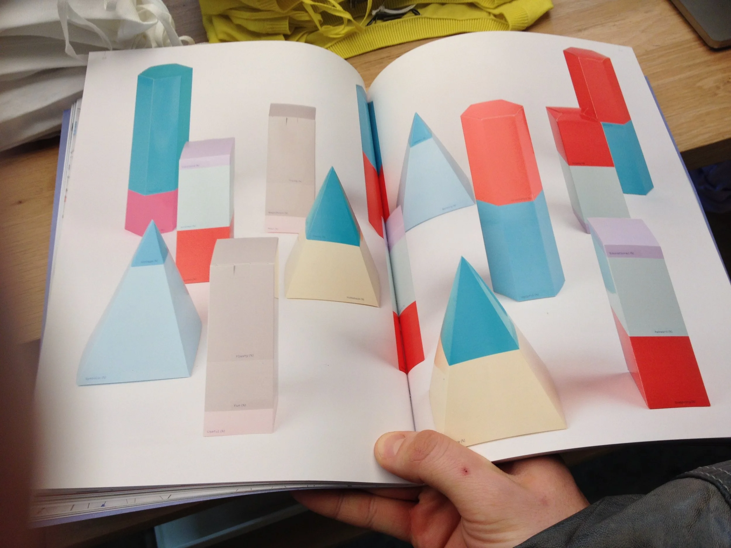
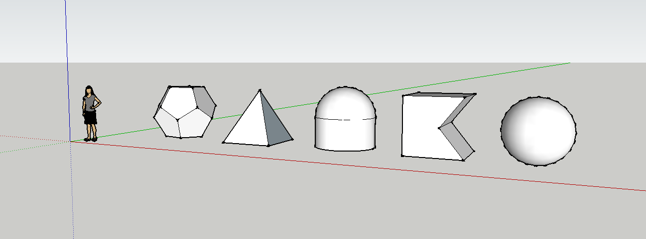
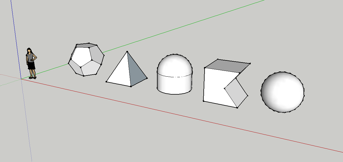
After collecting geometric graphic design reference material months later, I gave into minimalism and designed very simplified, geometric, bauhaus-style letters. I developed this concept from sketch into digital design, and even sculpted white 3D shapes made of clay.
Unable to decide how to utilize this treatment, or whether it was even appropriate, I decided to shelve this idea, and returned to using the static, solid D shape as a logo, with roman alphabet characters in Museo Sans for titles and text.
2015
A year later, I decided that using the umlaut in my name was incorrect and unnecessary.
I removed the umlaut, printed a second batch of business cards and accented the card edges by spray-painting them neon blue to match my digital palette.
2016
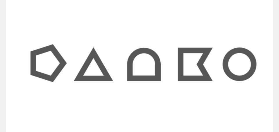
In 2016, I returned to the idea of geometric shapes, and refined my previous concept, designing what became the current full DANKO logo.
I combined this concept with the long-time Creative Monster term, considering various business card and layout design concepts featuring imagery of animal maws.
Eventually, I settled on simple, classic white on black. I continued to use the solid D logo when dimension restrictions required it, or for singular emphasis on letterheads, invoices or other correspondence.
2017
In 2017, I returned to the concept of masked images of my work and created a multi-layered, looping GIF, used as a dynamic variant of the D logo in email and web footers.
I also created a stylized jackknife GIF animation, used in the Info section to illustrate a reference to my multi-disciplined skillset.
This was also the year I launched DANKOMADE, whose logo I created by combining the existing DANKO D shape with the silhouette of an industrial nut. You can read more about this design process here.
2018
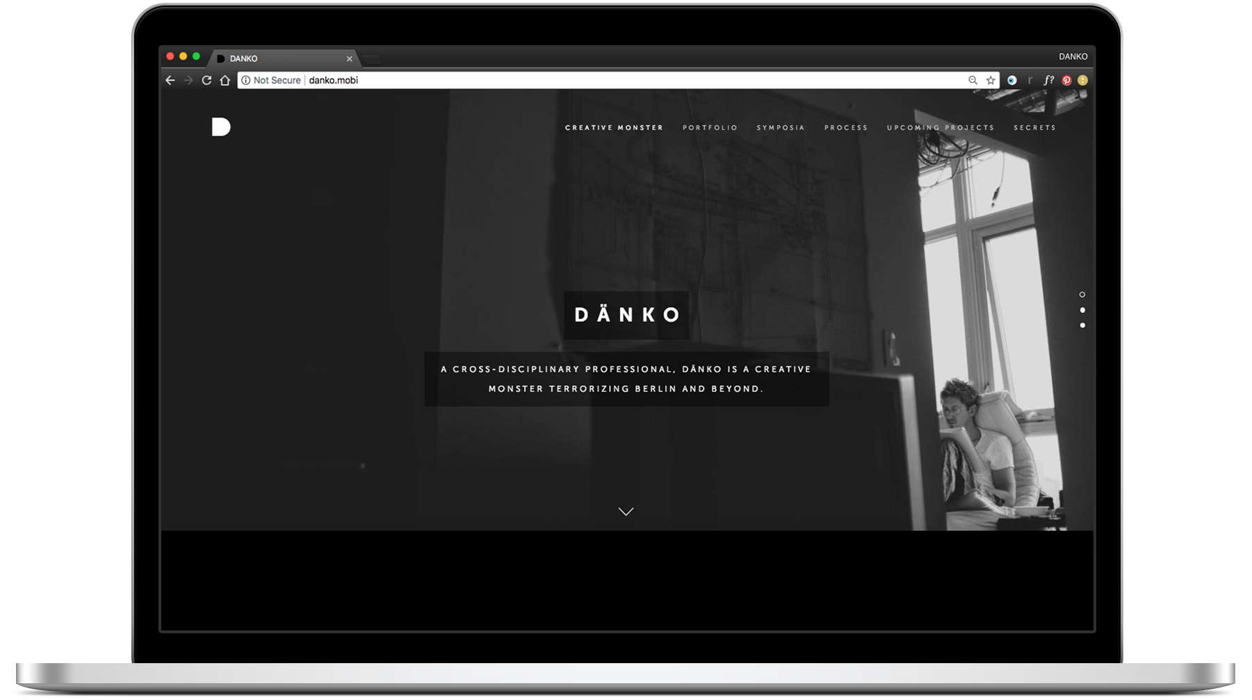
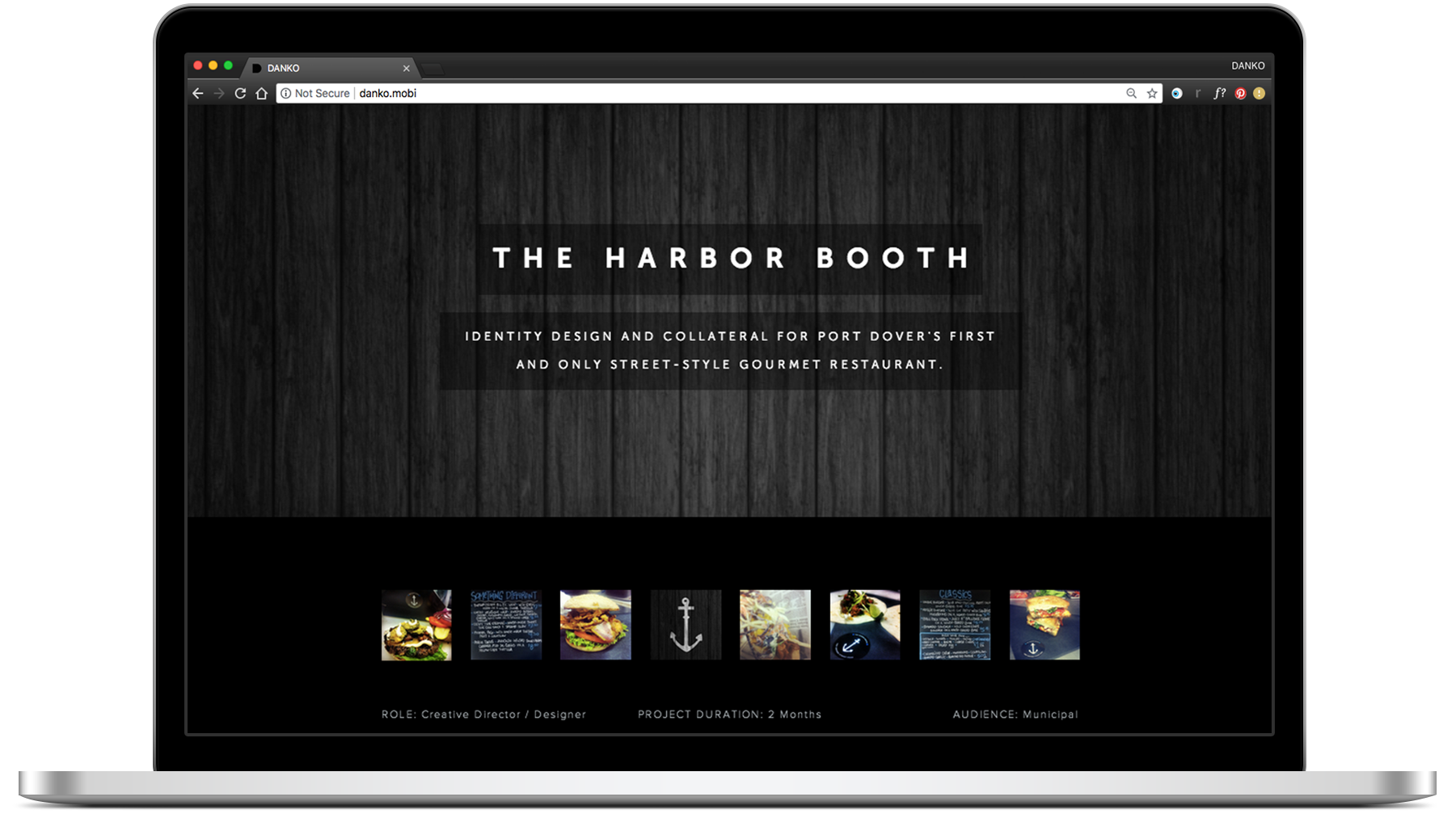
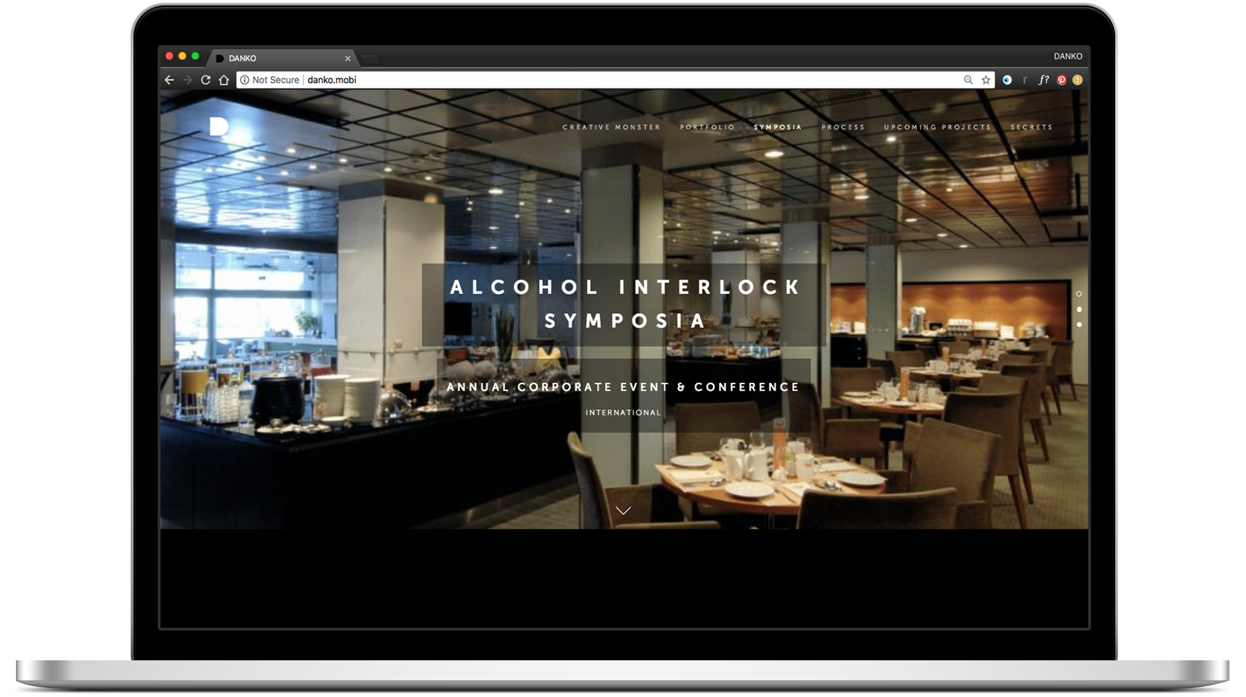
During the summer of 2018 I simplified and updated my responsive Squarespace website, including imagery and headshots. I reorganized and curated the site index to feature individual project pages, cut the sections down to three, and reintroduced a password-protected 'secrets' tab for sensitive content, and optimized everything for desktop and mobile.
I kept the electric blue for print and correspondence accents, but replaced it with magenta for web links.
Lastly, I edited and updated the looping D GIF.
** ADDENDUM - NOVEMBER 7 2019 **
A reader was recently kind enough to provide feedback and an additional resource regarding this post. Should you be reading this and in search of a useful free font database as a starting point for your own work, please visit https://www.websiteplanet.com/blog/best-free-fonts/.
If not already clear, I am a firm proponent of the very fine art of typography design, and must emphasize the legal (and moral) importance of purchasing fonts for commercial use. Respect and credit where it’s due! 📐
2023
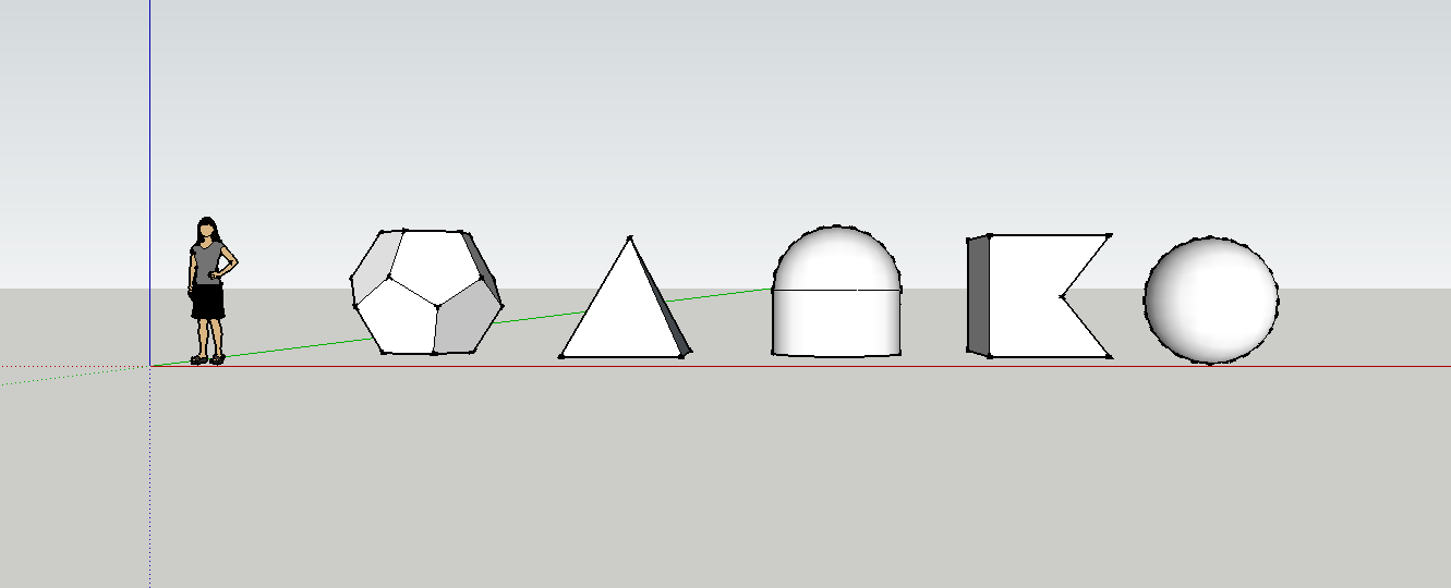
During the winter of 2023, I concepted, designed and rendered a 3D version of my simplified white geometric DANKO letters using Blender.
I selected an isometric camera view to animate them in a position similar to the original, brightly lit from above to produce the desired shadows. I intentionally staggered and looped the rotations and transitions to play with subtle anticipation and repeated observations. The animation has now replaced the static white header logo on the site, but remains in use on my CV, signature, and other correspondence.
2026
By 2026, I am still using my geometric DANKO logo, animated logo, Museo typography.
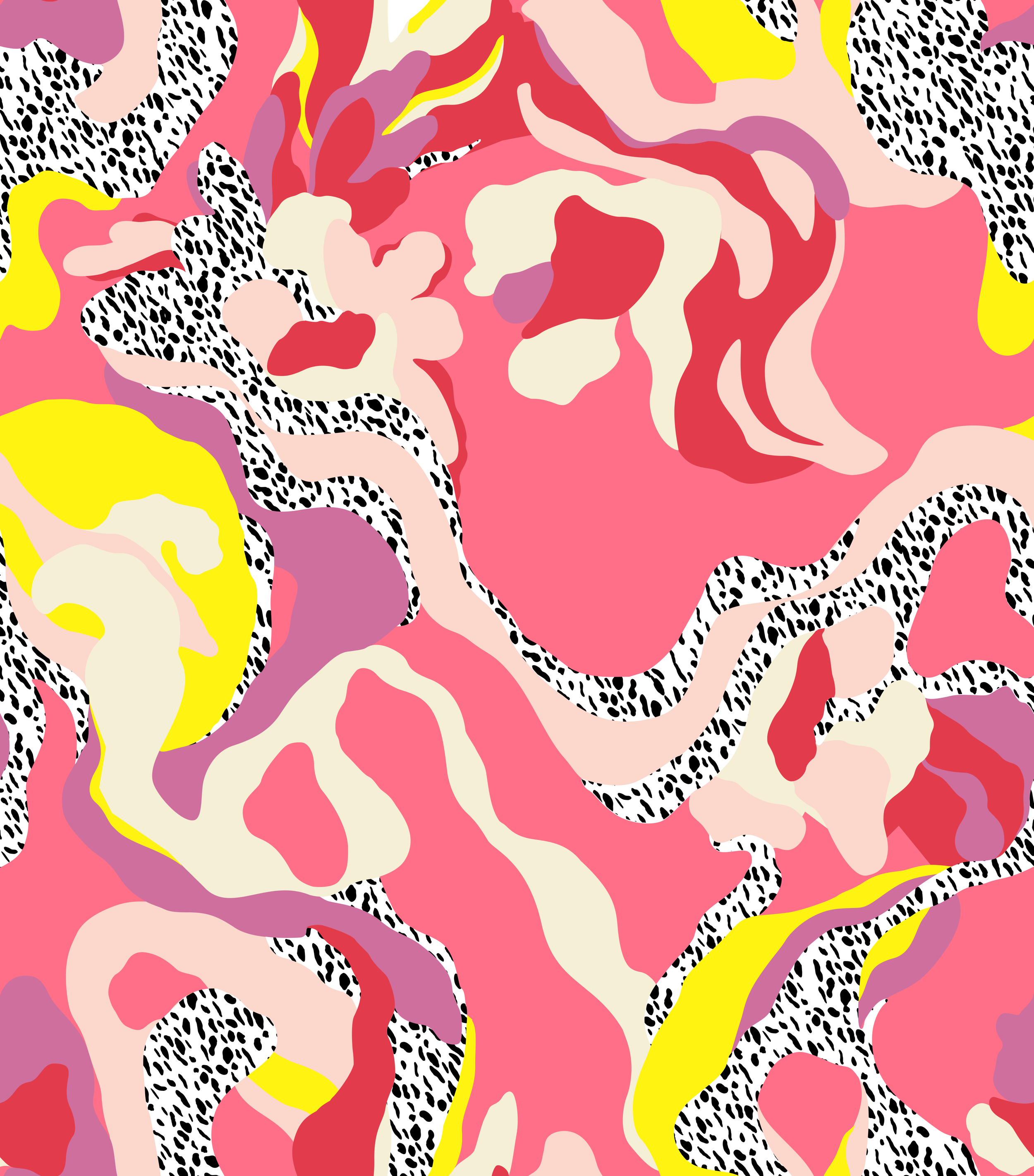
I’ve ditched the blue entirely, and have embraced hot pink as a definitive accent. Inspired by a particularly loud textile pattern I discovered during a surf trip while summering in Lisbon last year, I also isolated a few additional colours, patterns and shapes to use, in addition to warmer greys. These are used extremely sparingly.
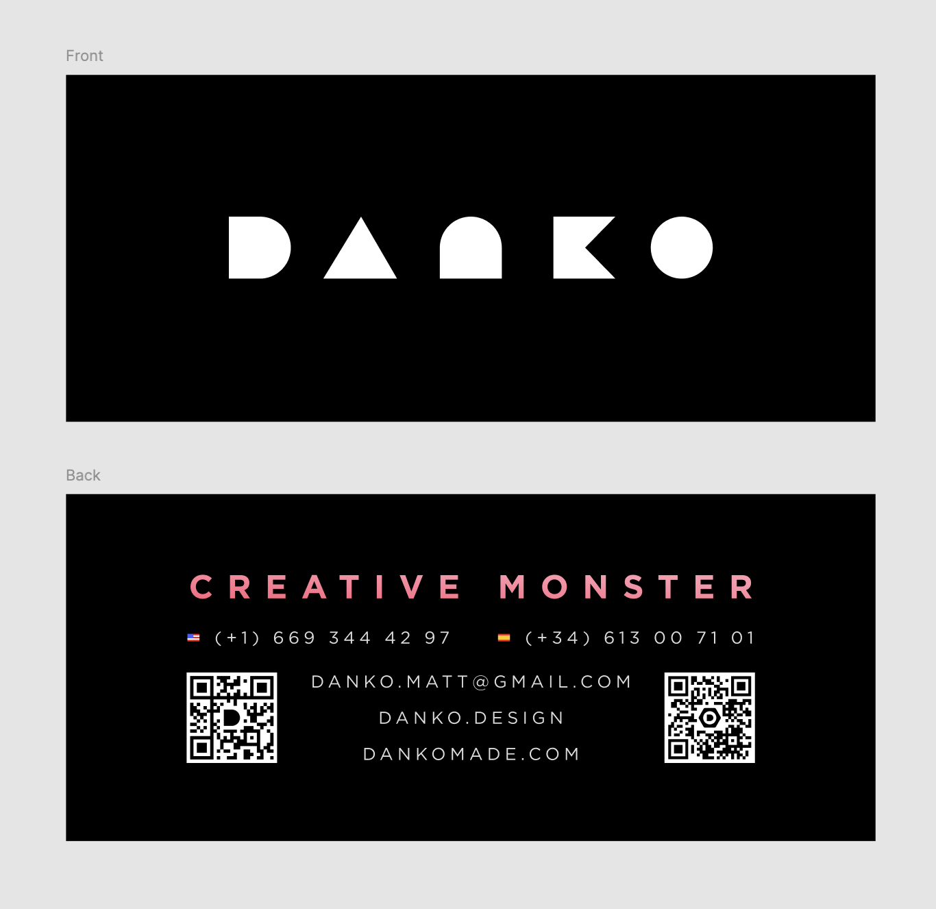
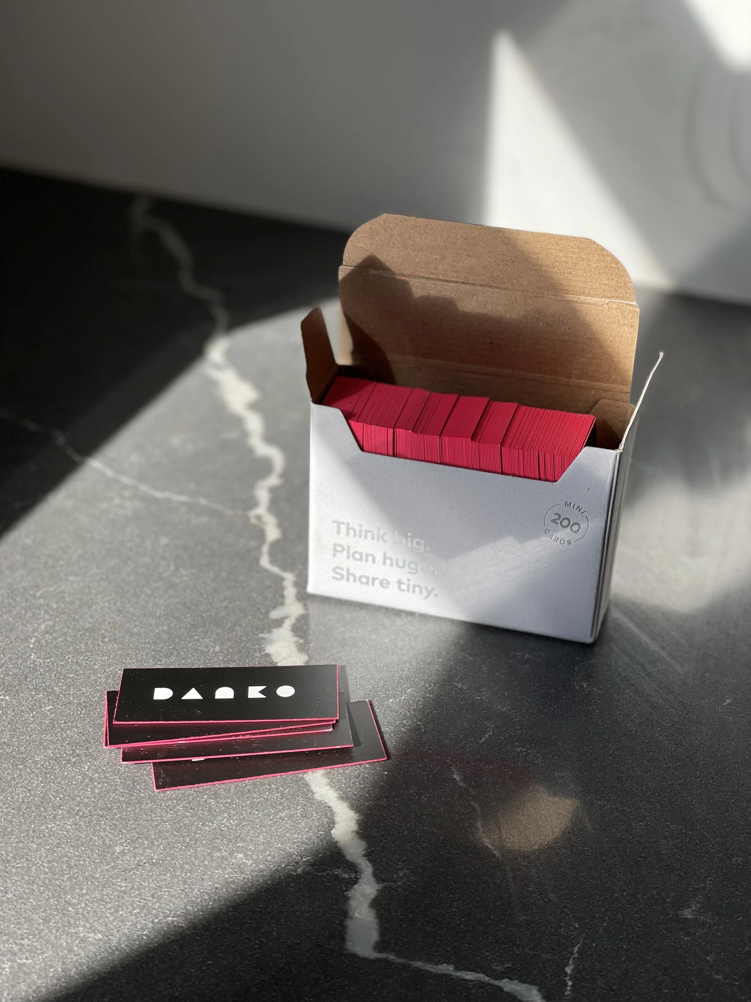
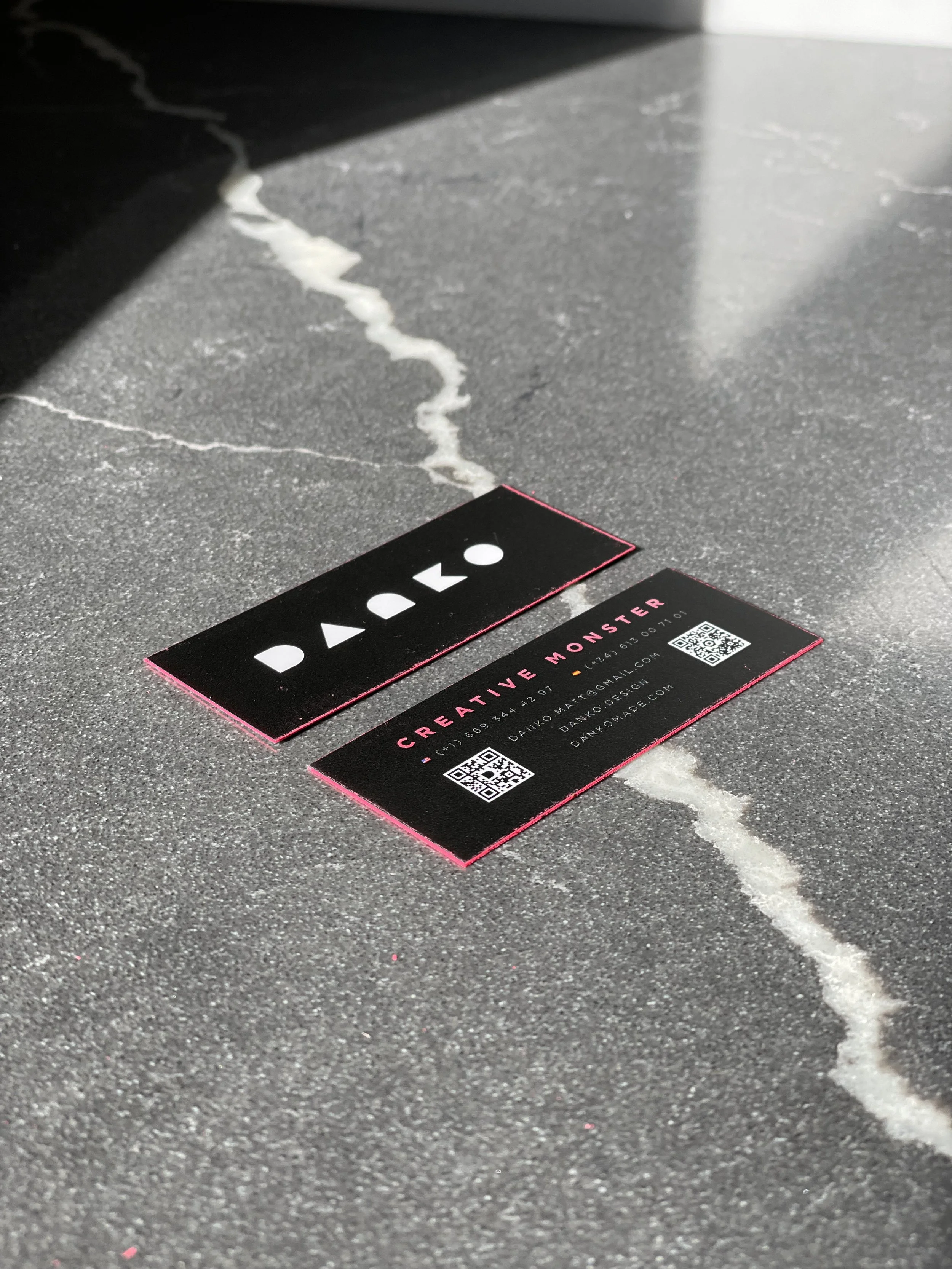
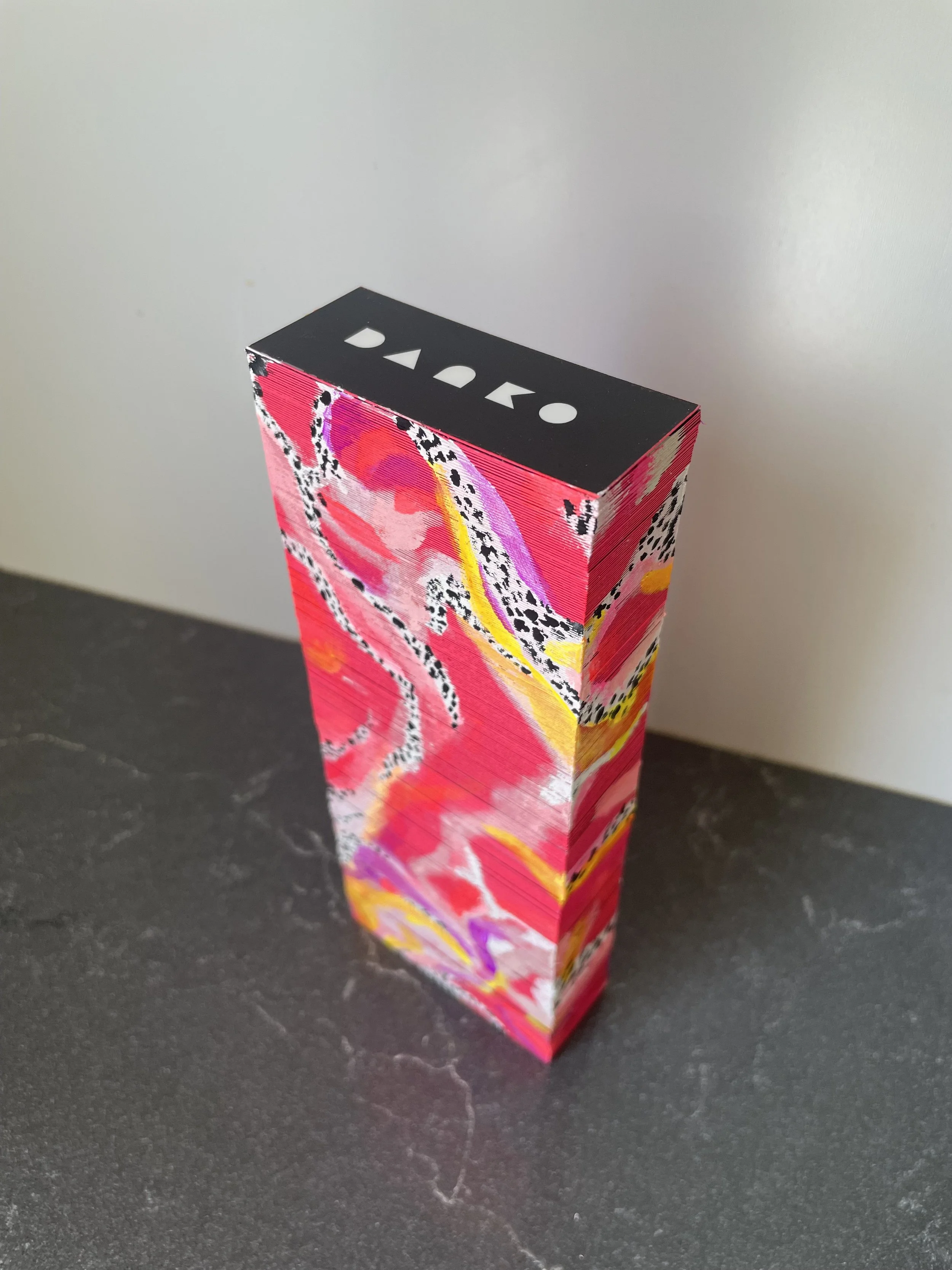
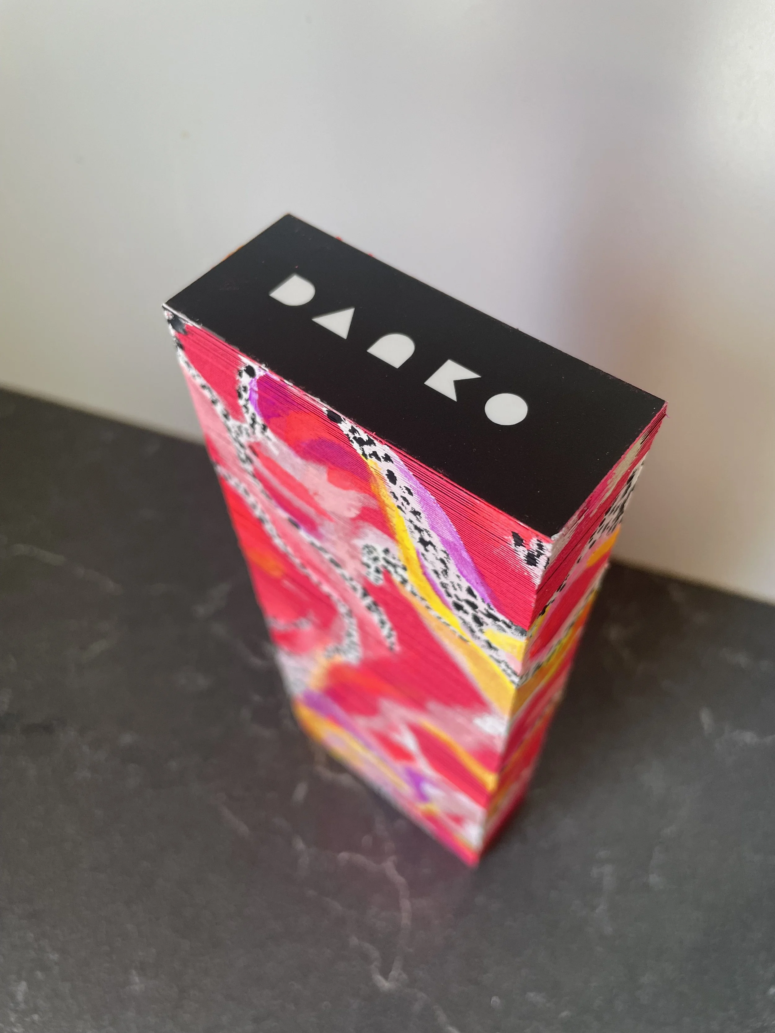
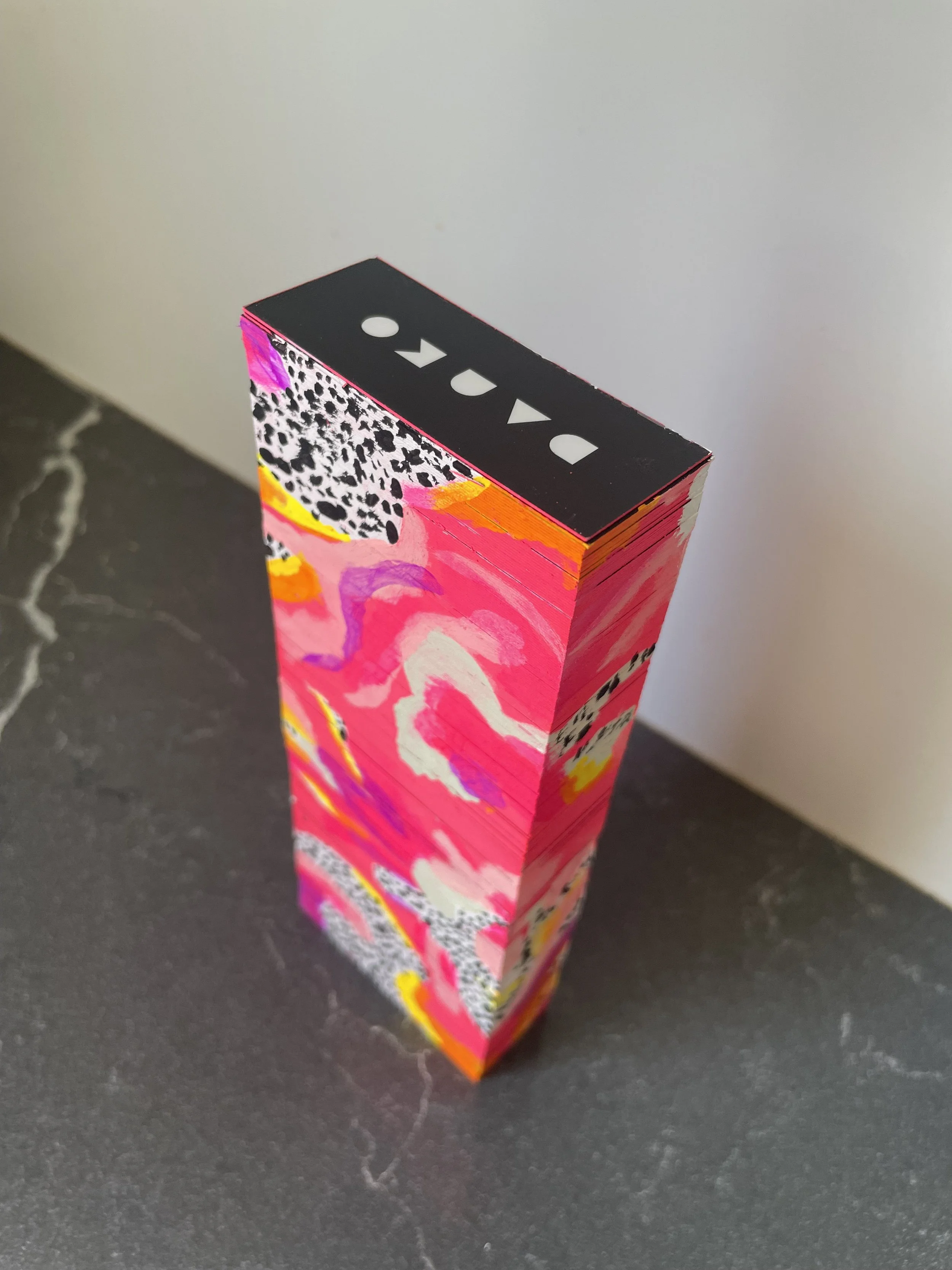
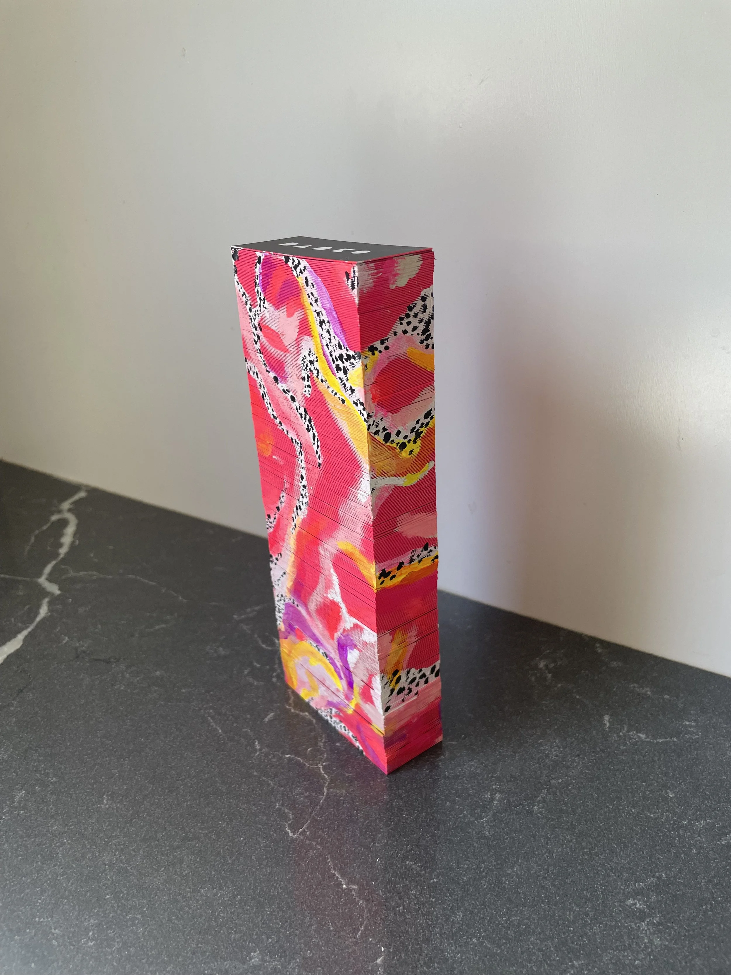
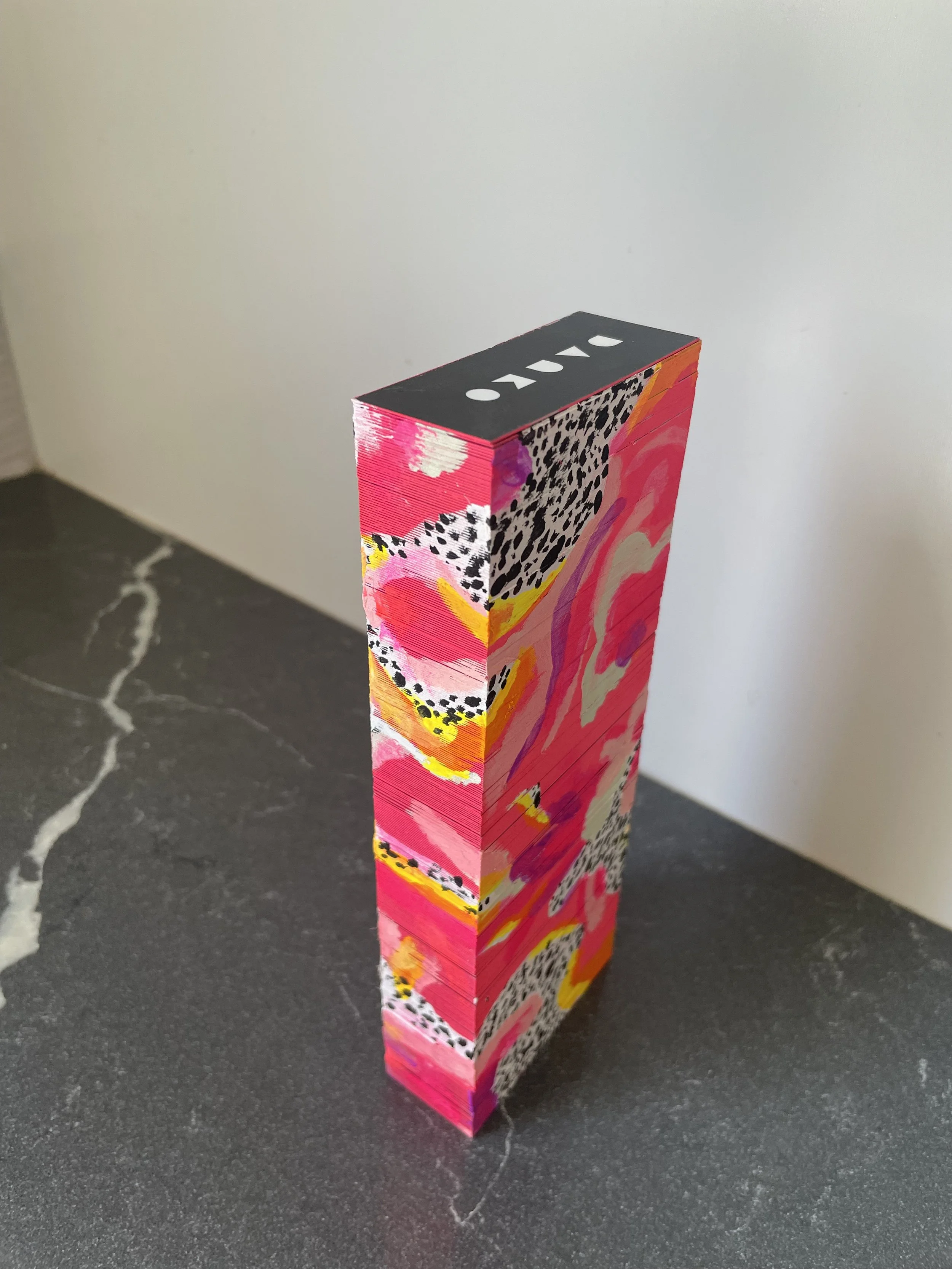
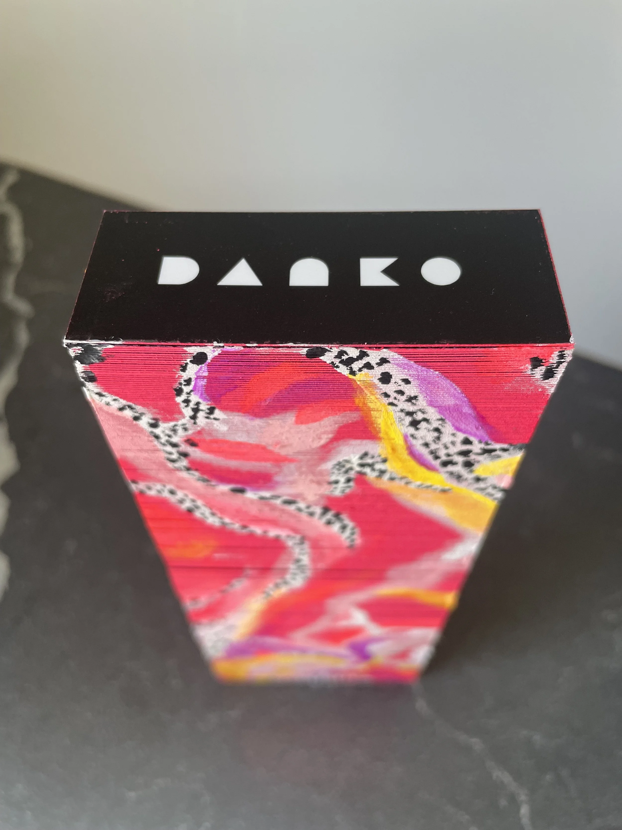
After some deliberation around layout and the use of QR codes (most people seem to prefer reading actual text and deciding to actively type in a website vs. pointing their phones at an abstract crunchy square to see where it takes them), I settled on this tiny business card design and ordered a few hundred of them.
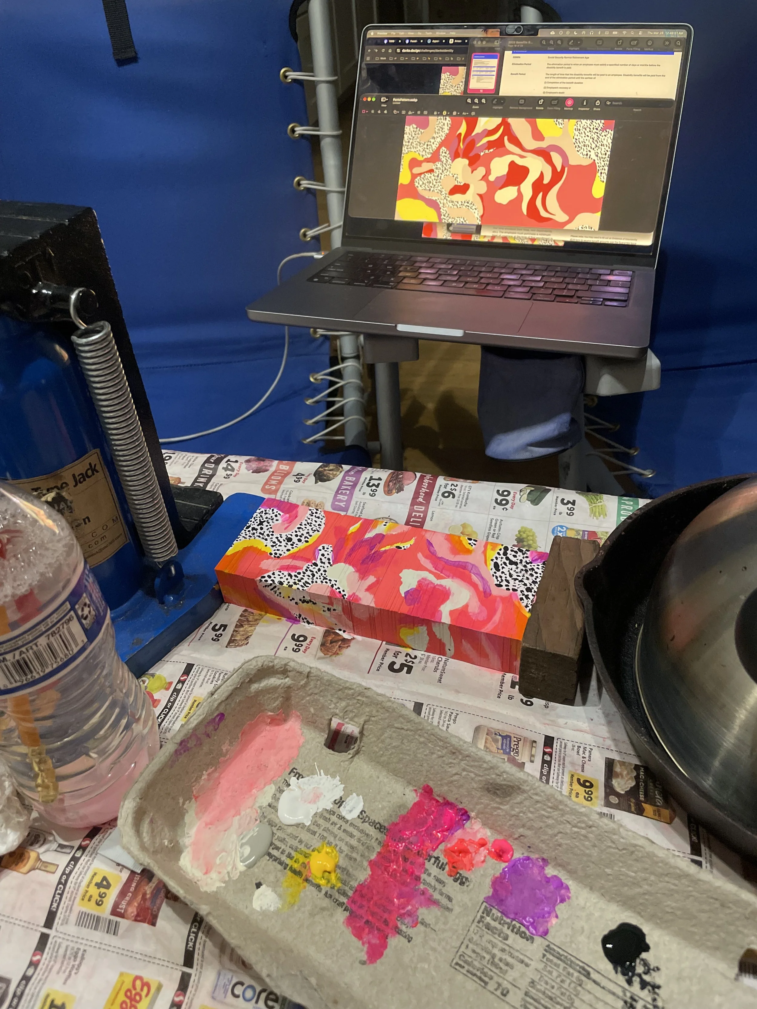
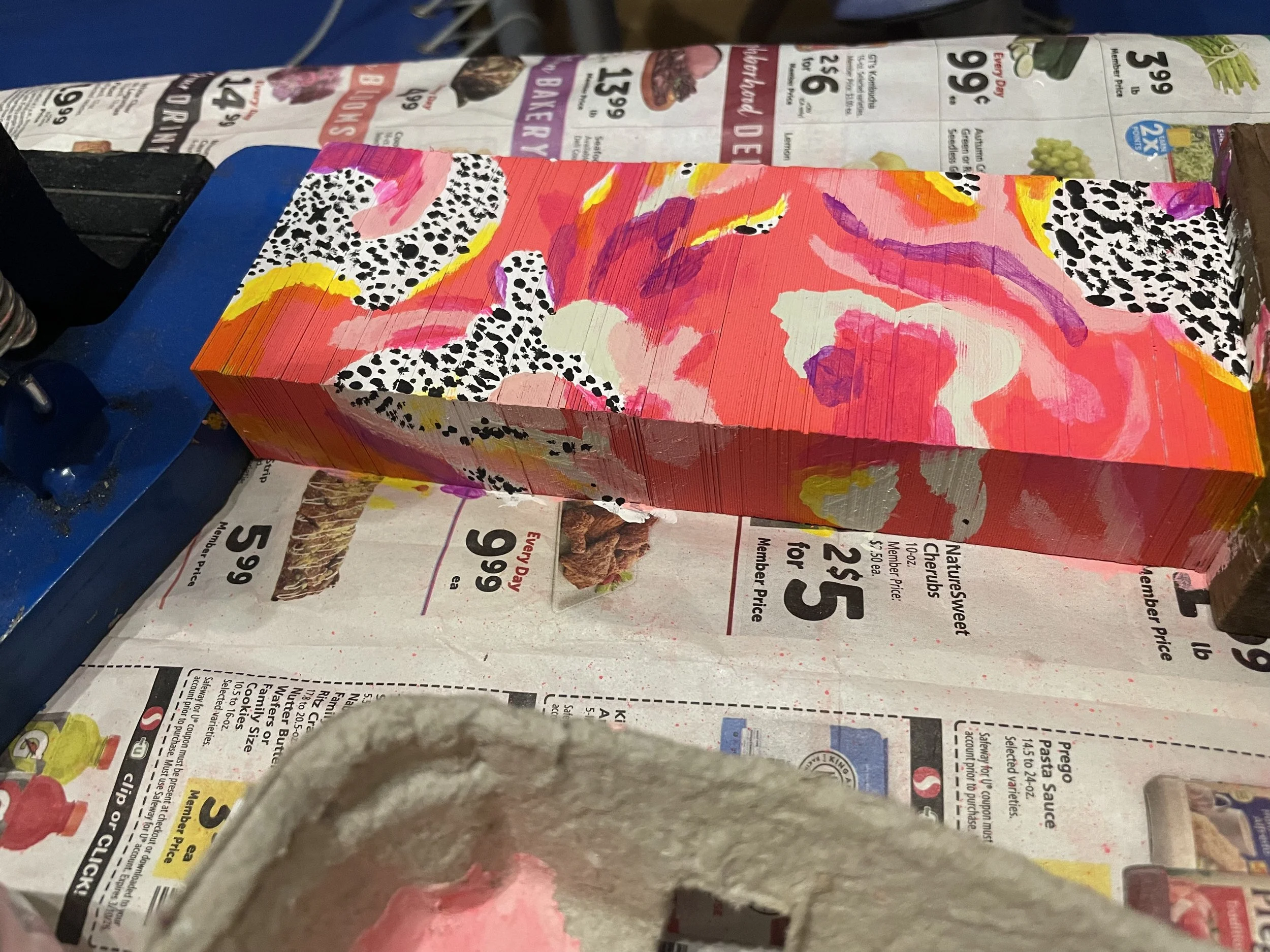
I then bought myself some neon pink spraypaint, tightly clamped a brick of them together and made those edges far more exciting.
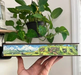
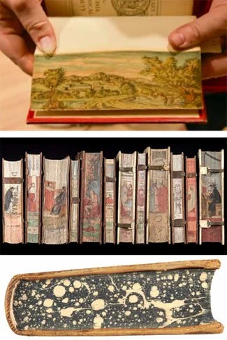
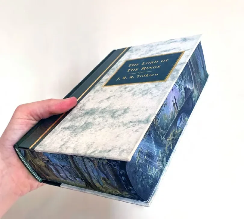
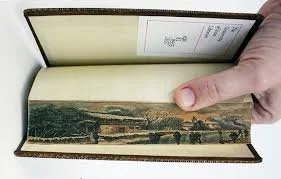
One further step to take with this direction would be to paint the coloured pattern above on the colourized edges - a treatment similar to book edge illustration, but smaller and less elaborate…
I’ve of course updated the transitioning D gif with various new imagery with various instances from adventures and projects, and will continue to do so.
I’ve also begun creating versions of just portraits of myself, as sort of a visual record of my aging process; the irises are used as a focal point/anchor, fixed as the gif cycles through various transitions.

