

PFLEGE. VIELFALT. LEIDENSCHAFT.
English translation:
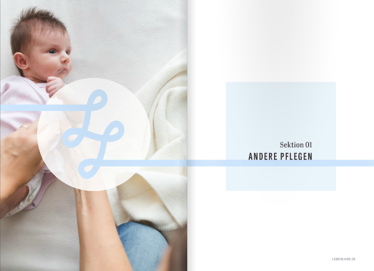
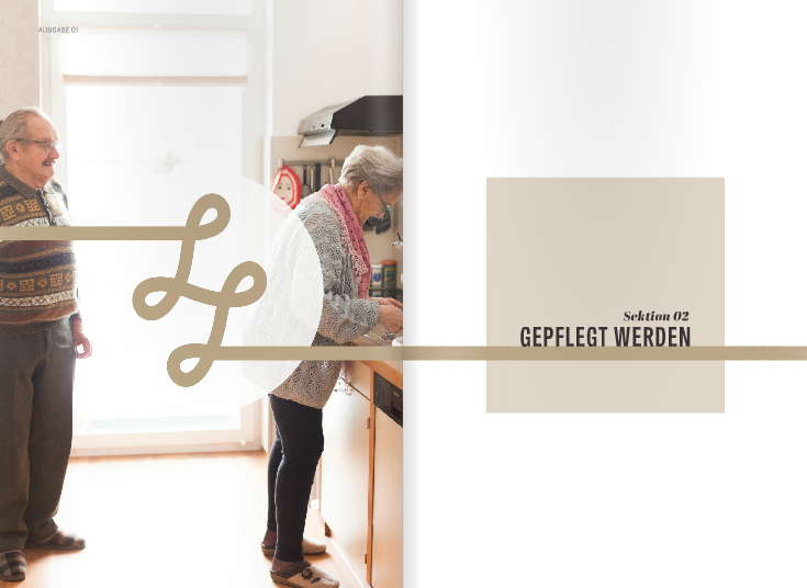
LIFELONG
CARE. PASSION. DIVERSITY.
Lebenlang is a digital magazine conceived, developed and launched by Carry-On Trade Publishing (COTP) in Berlin, Germany.
Focused on health and lifestyle trends for an aging German populace, Lebenlang provides resources and information alongside calm, clear layouts and minimalist design.


Following a successful typography collaboration, COTP approached me to design a logo for this new venture.
After preliminary research, I remembered the ancient Greek allegory of the Moirai: a trio of sisters responsible for the direction of fate and control of the metaphorical thread of life of every mortal from birth to death. I drew inspiration from this myth and began working with familiar life symbology, including lines, branches, circles, curvy shapes... and ribbon and string.

Among my initial sketches was a concept with two capital L’s, created from a single, continuous, flowing line.
While visiting the COTP office to review these and other concepts, I used a scrap yard of yarn leftover from a previous product shoot to explain and exemplify continuous line.
By physically manipulating the string into looping LL shapes, I immediately recognized the vast potential of this idea. Combining design and metaphor, this concept calmly conveyed direction, path, horizon, story arc, lifecycle and continuity, a perfect representation of the project.
I pitched this logo idea on the spot, and this definitive moment of creative thinking immediately resonated with the client.
Together, we conceived packaging applications and video ideas to reinforce the concept, involving knitting, food, toys, gift wrapping and other materials and scenarios.
Following this unexpected brainstorming session, three of these concepts were produced, shown here.
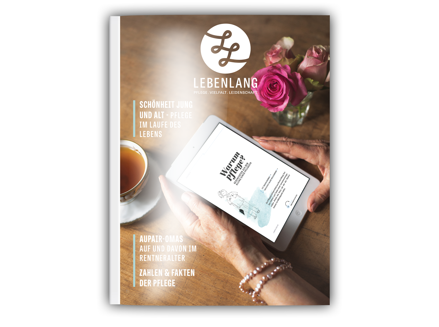
Next, I refined the concept into a monogram, creating a clear, strong logo for the publication.
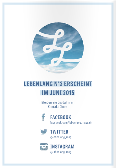
By inverting the original line version, I created an alternate variant that provided negative space.
This representation was suitable for colour contrast or image imposition, as seen in the examples below.


Since launching in 2015, Lebenlang Magazine is available online in both German and English, and for download via Google Play and the Apple Store.
