Neverdale Park is a colourful, free to play match-3 mobile game set in a mythical, retro forest amongst fantastic woodland creatures.
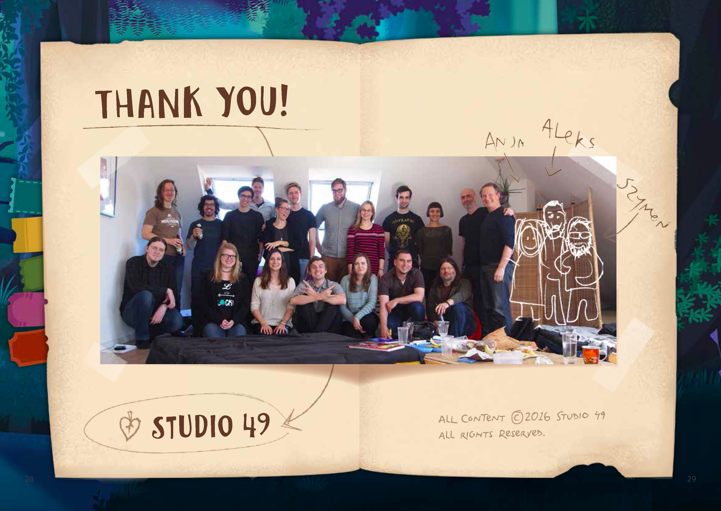
Developed and designed by Studio49, an independent mobile games studio located in Kreuzberg, Berlin.
My contributions to this game included brand and identity design, UI, UX, typography, creature mythology and marketing content.
As the Head of Design at Studio49, I coined the game title, designed the logo and iconography, created the style guide, shaped the story and helped develop the creature mythology.
I also designed all of the typography used in the game, contributed to UX & UI processes, and created marketing and promotional material for international campaigns.
After meeting our vertical slice milestones, exceeding investor expectations, receiving positive user-test feedback and polishing the game UI, the Studio49 Team successfully soft-launched Neverdale Park via Google Play in Brasil in the spring of 2017.
While experimenting with an ideation cloud of word combinations, 'Neverdale Park' emerged as my favourite title candidate, and was unanimously accepted by the team and stakeholders.
With a definitive title, I began to explore a variety of logo concepts, styles and treatments.
I drew inspiration from existing game art, our working prototype and the initial story drafts.
During my logo exploration, four strong logo concepts developed: The Jackalope, The Spooky Eye, The Retro Badge, and The Wooden Sign, all clearly displayed here.
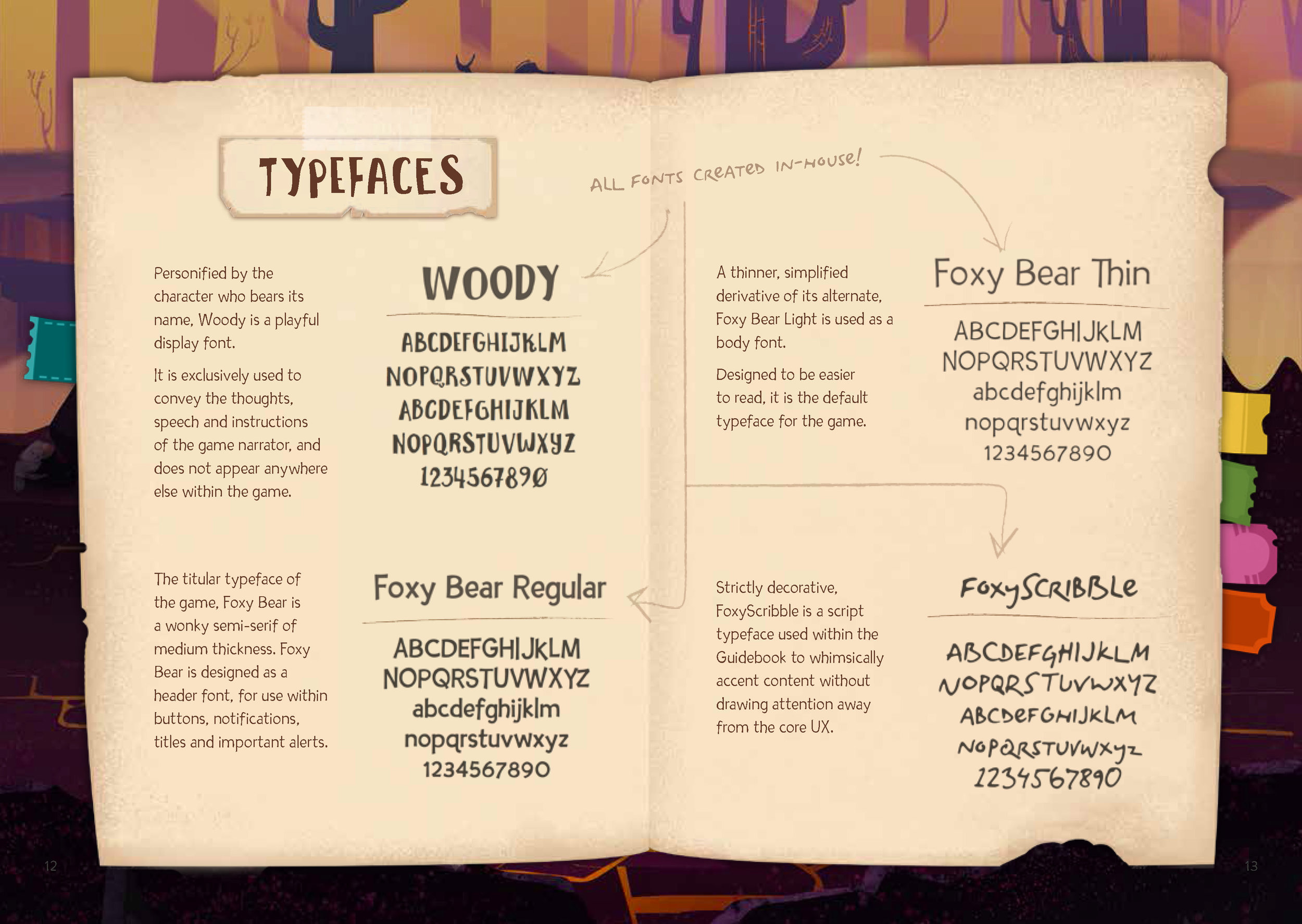
During logo development, I simultaneously created four game typefaces.
They're available for review and download available here:
Wolpertinger is a wonky semi-serif typeface, designed for body copy.
DankoScribble is a script typeface based on my own shorthand.
Personified by the character who bears its name, Woody is a playful display font.
Designed for UI indicators, Team Logo is a thick, bold display font that carries the style of the game art.
Ultimately, a variation of the Wooden Sign concept prevailed as the team favourite.
To finalize it, I worked with illustrators to refine the Neverdale Park logo to match the game art, then applied my Wolpertinger typeface to the game title.
I separated the logo into layers for later animation, eventually used in the onboarding screen, as well as advertisements, social media and online promotions.
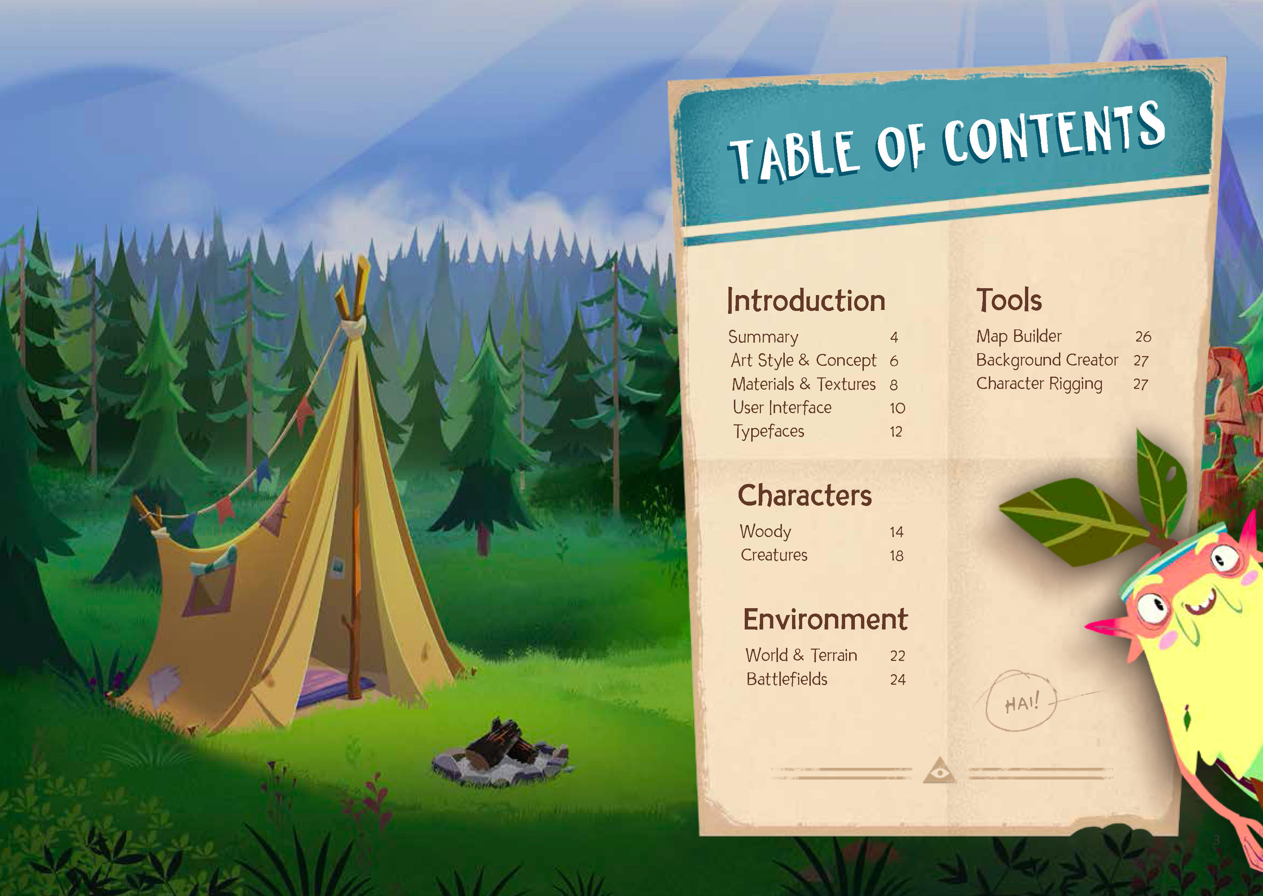
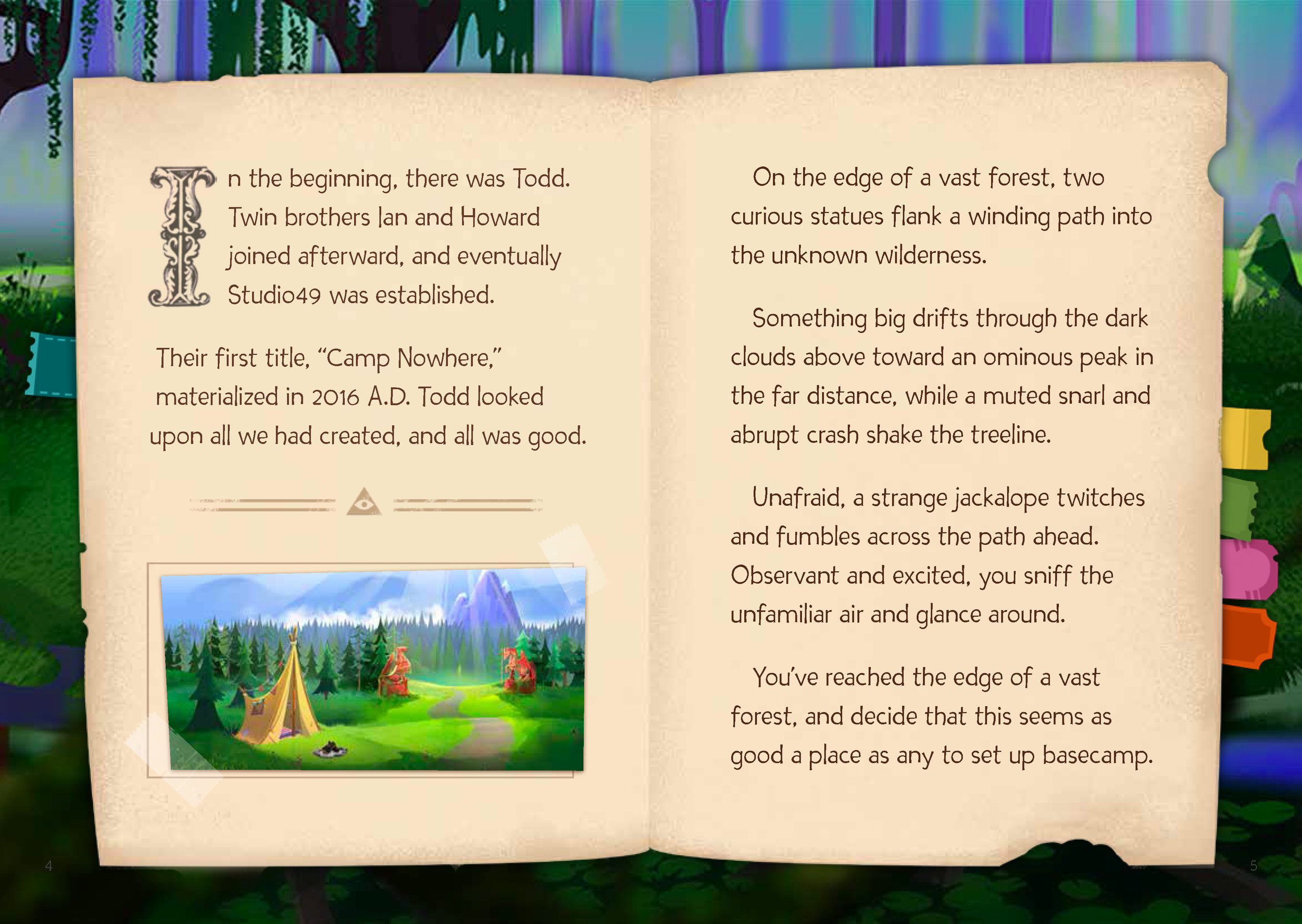
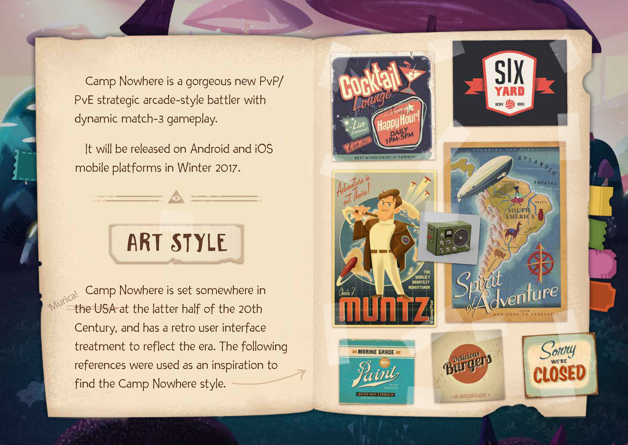
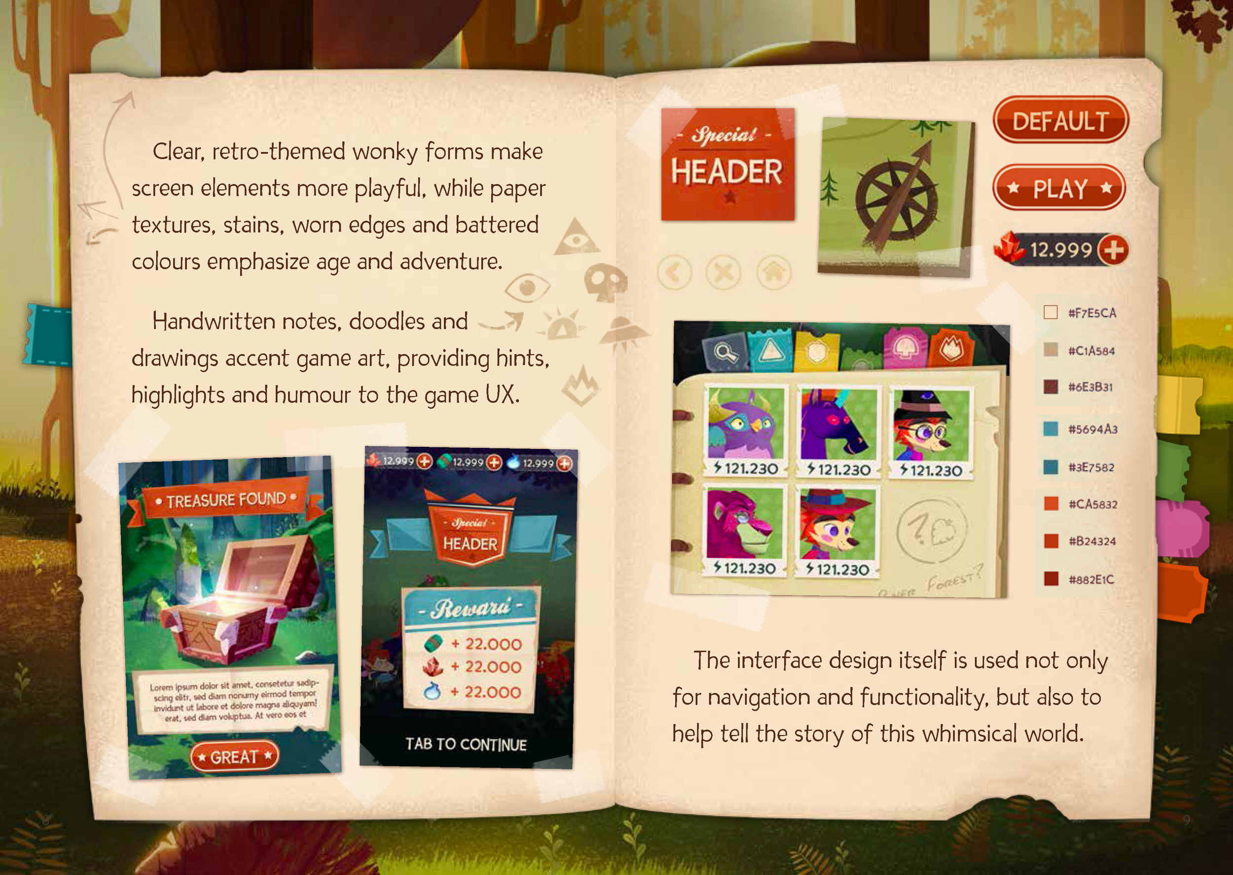
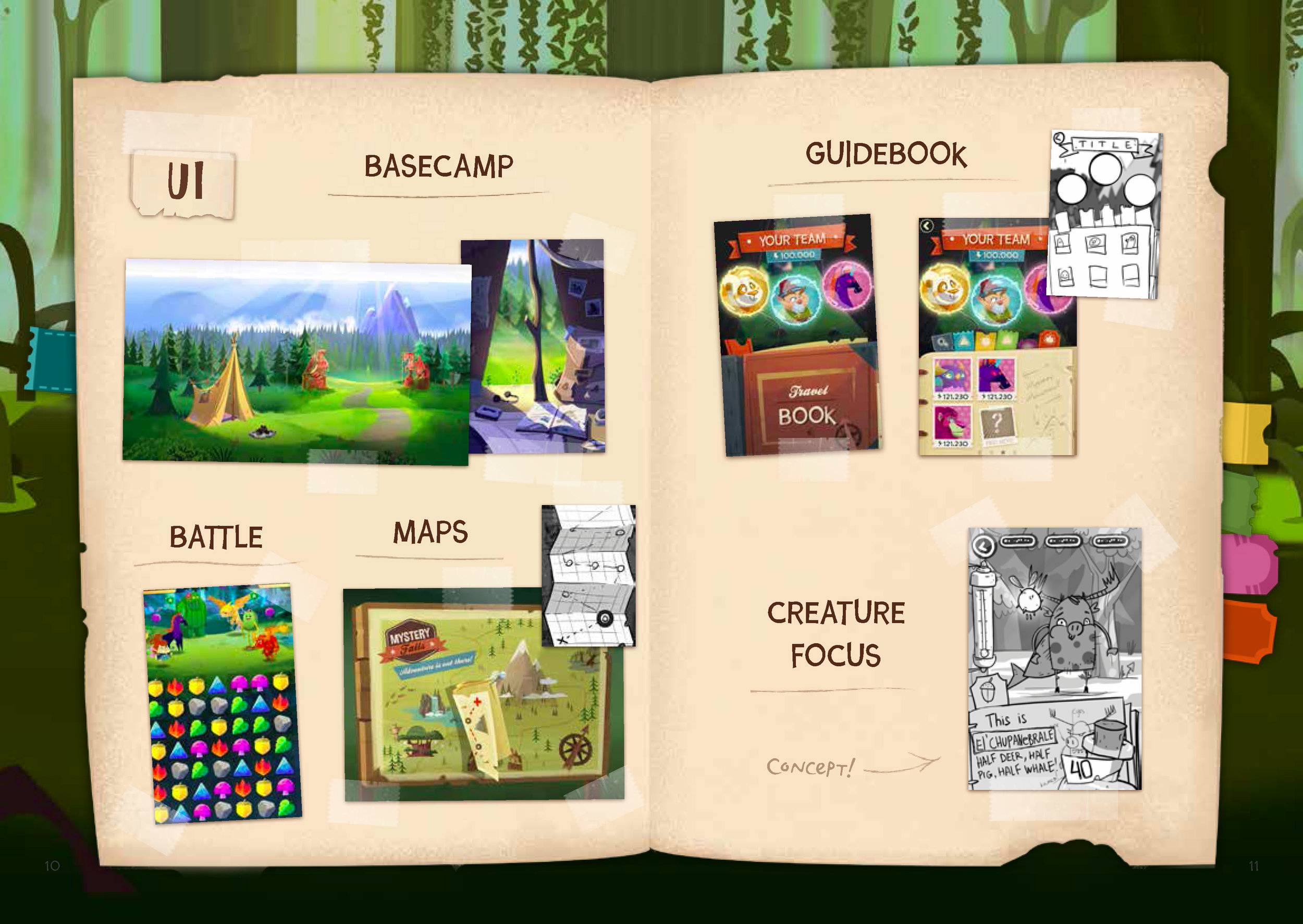
After defining the title, completing the game logo and creating typefaces, I began writing and designing the Neverdale Park Style Guide.
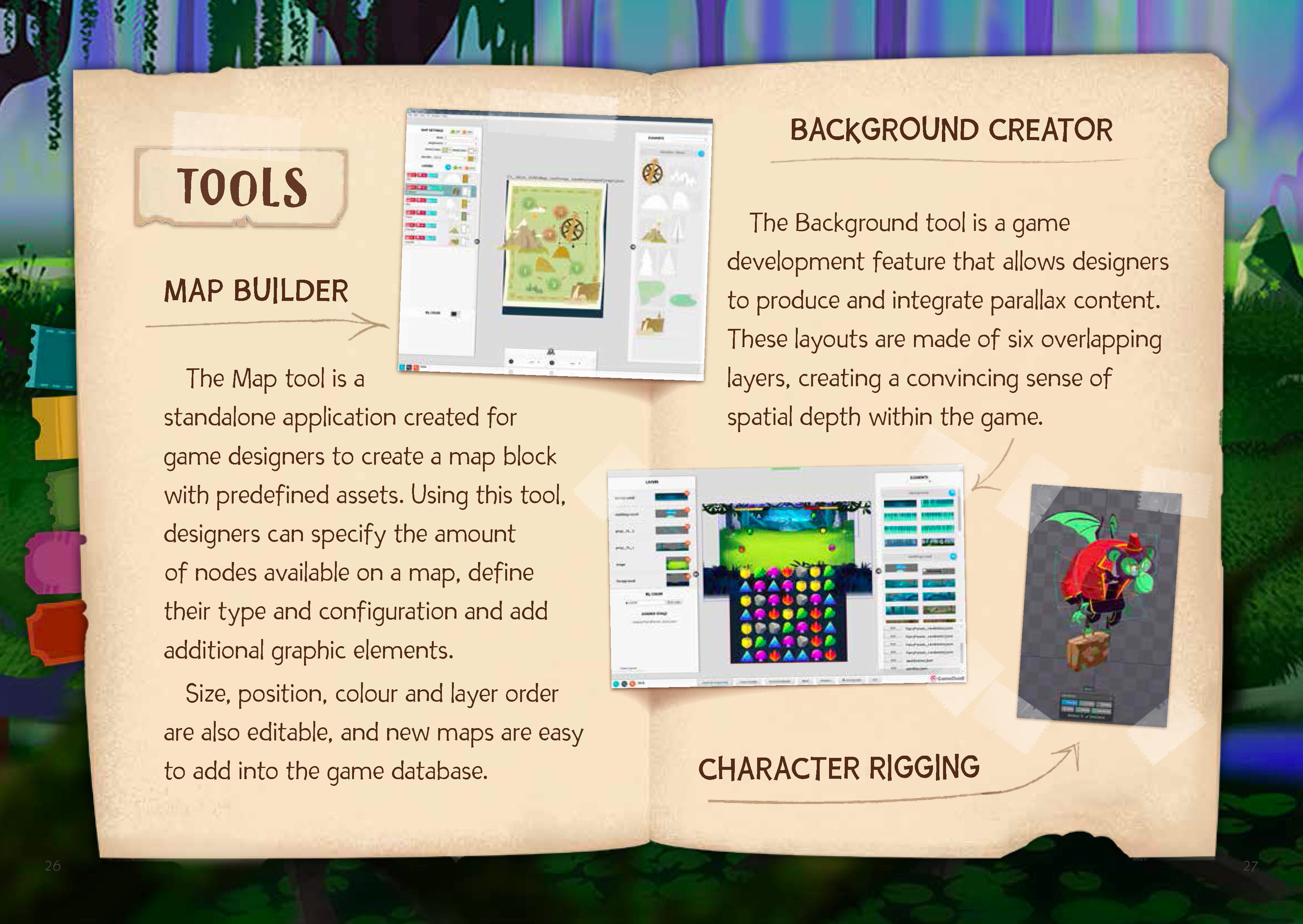
By gathering moodboard content, existing illustrations, prototype screencaps and concept art, I corroborated with all members of the team to refine and release the style guide, shown below.
Presented by stakeholders to potential investors, the Neverdale Park Style Guide proved an invaluable resource to executives when explaining the project, its scope, design and details.
To learn more, tap the button below the image to download and review the full PDF.
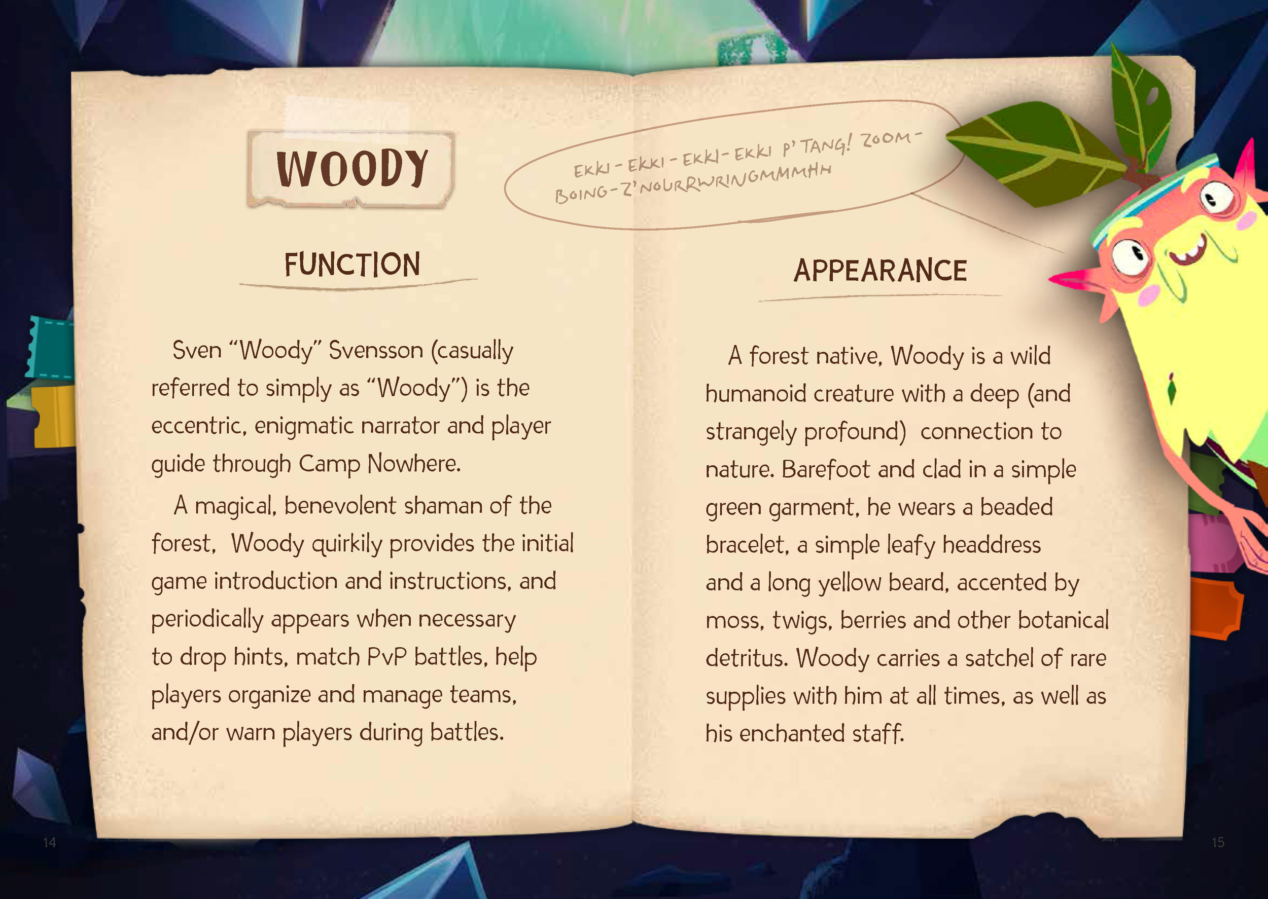
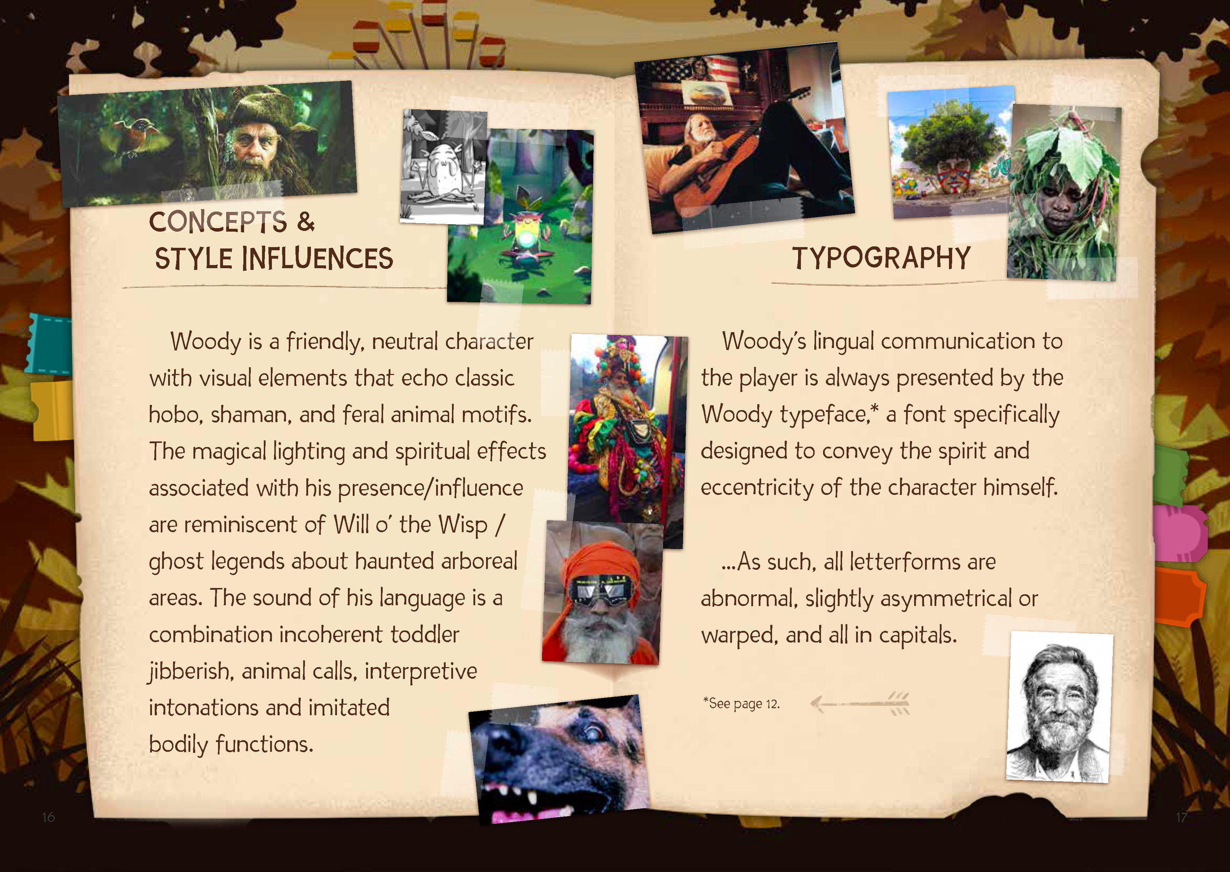
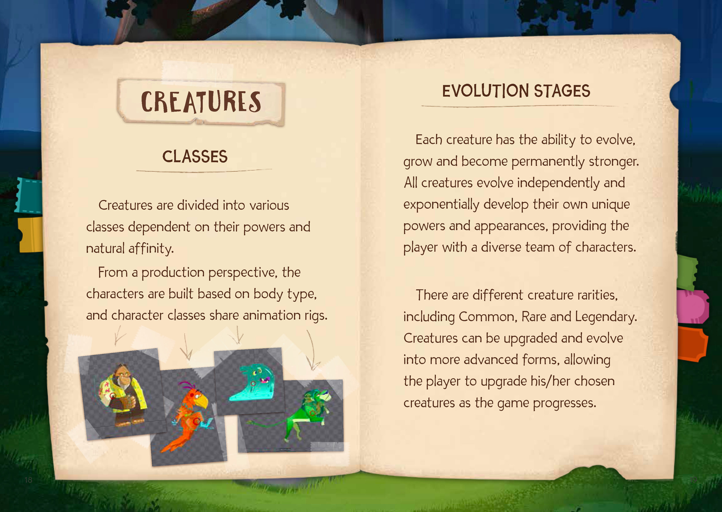
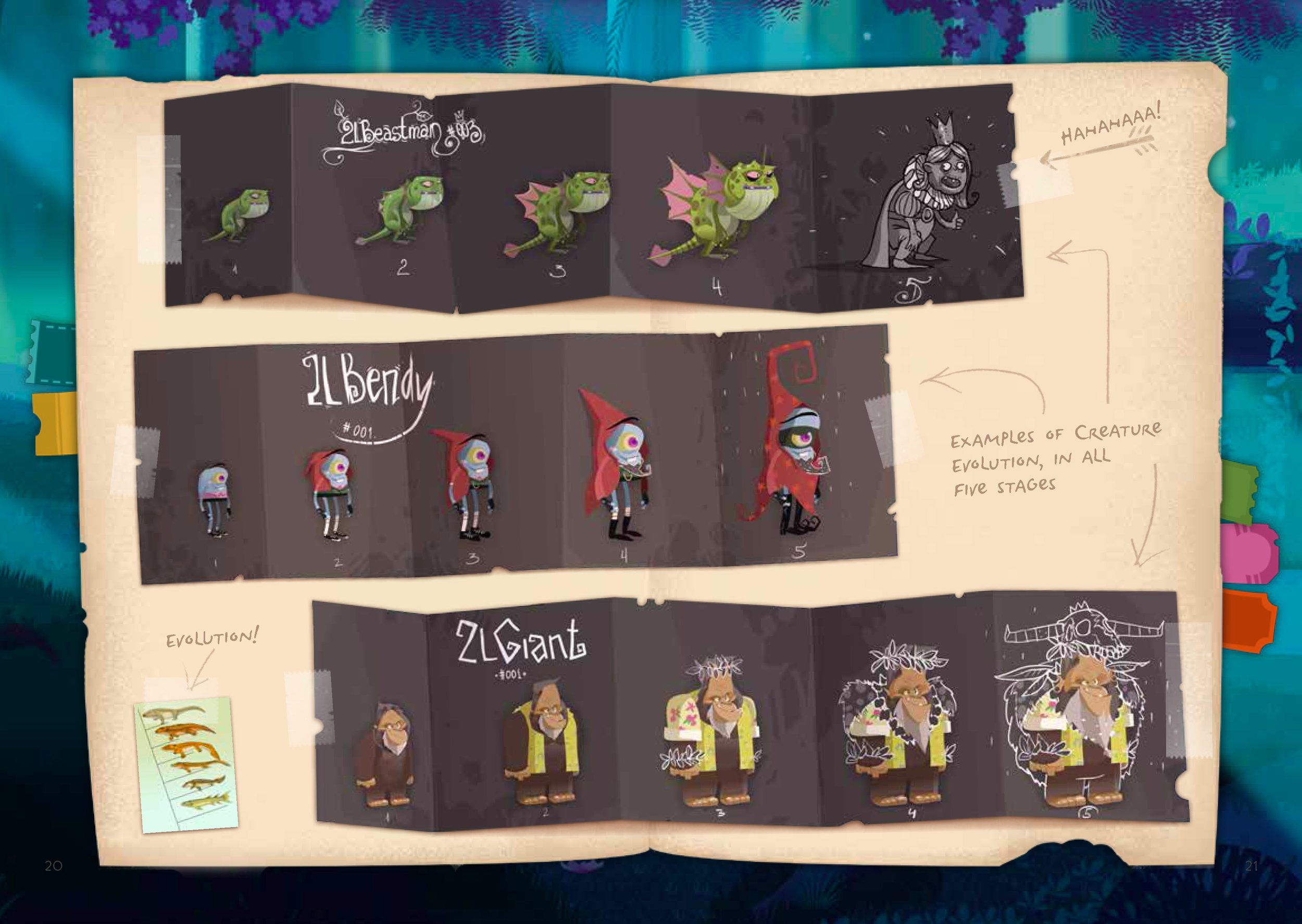
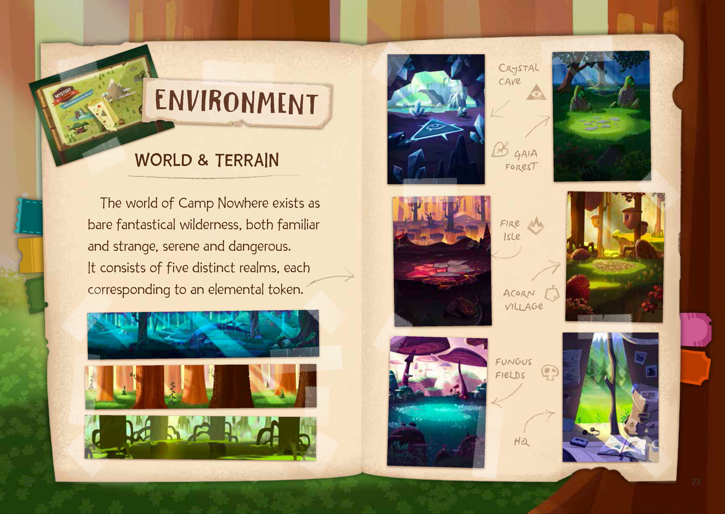
As a visual designer working on Neverdale Park, I helped shape the story of this world, create it's inhabitants and structure their mythology. Selected examples of this lexicon are shown below.
Neverdale Park is a classic tale of good versus evil.
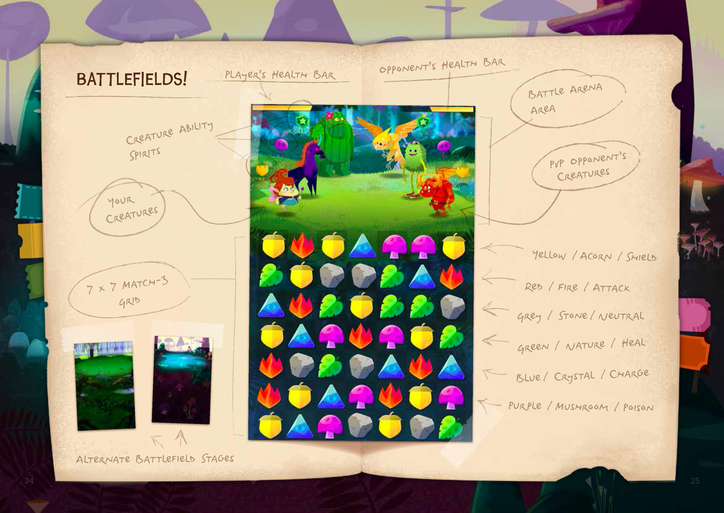
Assuming the identity of an anonymous hero, players embark on an epic quest to discover the origins of a mysterious scrapbook, leading to a legendary park deep in the wilderness. Upon learning that the park is cursed, players join and manage forest creatures to battle their corrupted peers, cleansing them in the process.
As the game progresses, stronger creatures are encountered, teams develop, creatures evolve, difficulty increases and the mysteries of Neverdale Park begin to unfold.
The Gates of Neverdale Park, featuring the game logo


