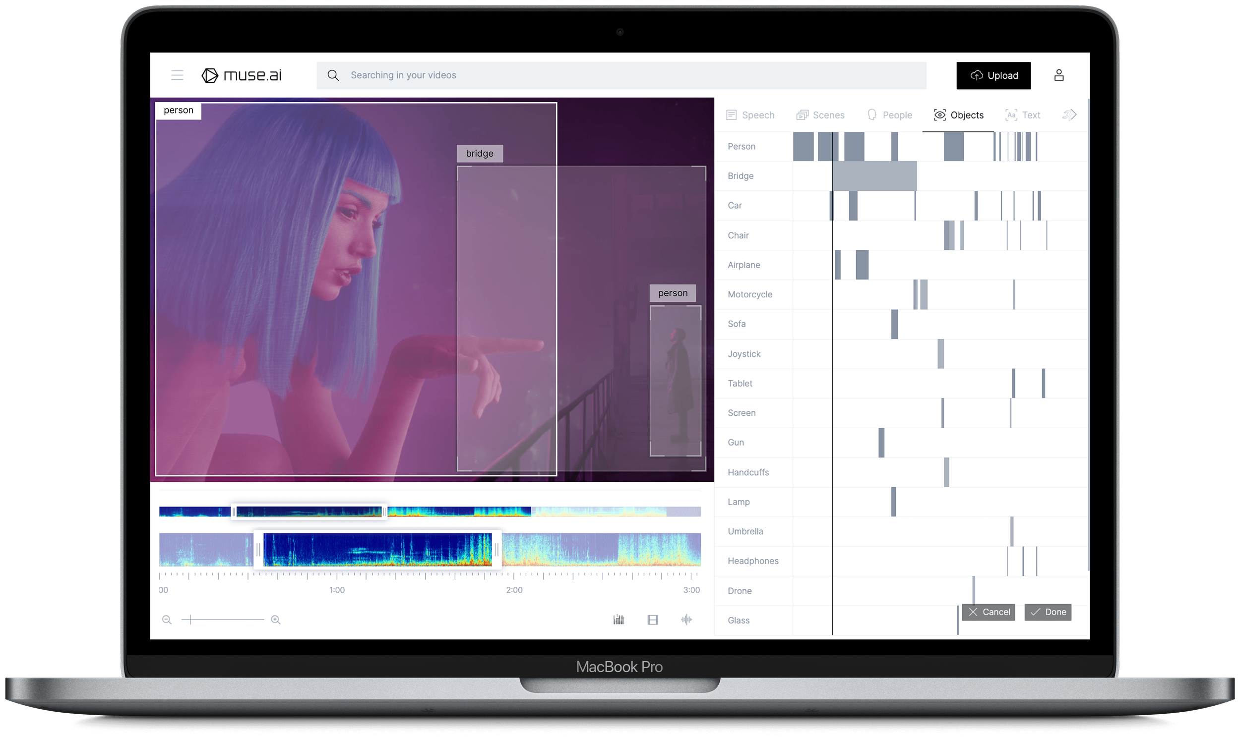
During the winter, I spent four days in Lisbon working with the Muse.Ai team to explore logo concepts and develop brand identity ideas.
Important influences in this creative process included AI functionality, data visualization, biological processes, pastel de Nata and synesthesia.
The following collection of reference material and refined variations convey and explain the unique identity concepts developed during this period.
IDEATION
To tackle this challenge, I researched and drew inspiration from a variety of sources, including neural networks, computer algorithms, classic visual illusions, sci-fi tropes, data visualisation and even the physics of light itself.


concept exploration
Beginning with linear variants, several concepts emerged. These early explorations occasionally overlap themes, providing early steps toward mature ideas.
A constant theme in early iterations is light itself. The definitive heart of all photography and video, light and the colour spectrum feature heavily in most of this work.


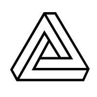
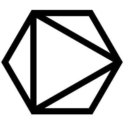
TRIANGLES
In an effort to simplify and stylize the monogram, I combined coloured equilateral triangles into a recognizable M shape. I then involved light properties by creating a third triangle within the overlap, animating it to simulate light spectrum combinations.

WAVES
Further elaboration upon uncovered a likeness to sound itself, visually interpreted as sinusoidal waves. A crucial element of video, I tried to develop this concept into an appropriate logo, combining it with input / output symbology, binary colour themes, circles and squares.
LINE & SHAPE
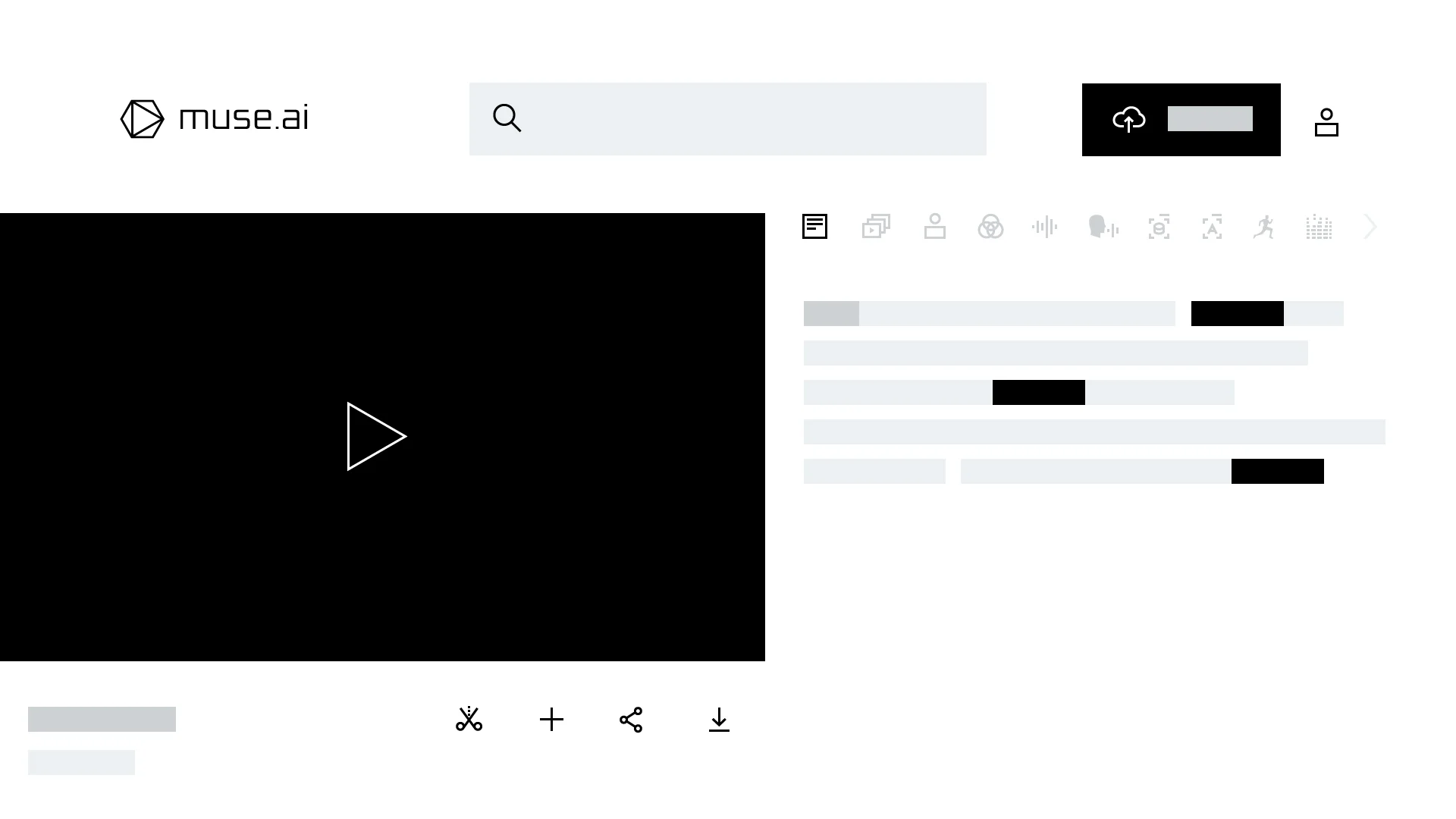
Building upon the Triangle monogram, I began adding linear elements and shapes into the M letterform, using red, green and blue to convey the legacy of RGB light diodes. I also combined the established iconography of search, memory and video, merging a magnifying glass, a stylized human head and a playback icon, respectively.
CURVEs + letterforms
This concept is a tangent of the Wave idea, solidified and cropped to form an abstract M interpretation. I tried including the other letters of the company name with a matching treatment to augment the M, however, the idea remains strongest as a monogram.
8-BIT pixel LIGHT
Returning to the exploration of light and its role in video, I tested spotlight effects in a simple animation. I then tried combining the style of classic 8-bit graphic pixellation with coloured spotlight dynamics to merge technology and light, first experimenting with abstract forms, forming an M, and then the word MUSE.
LINEAR M
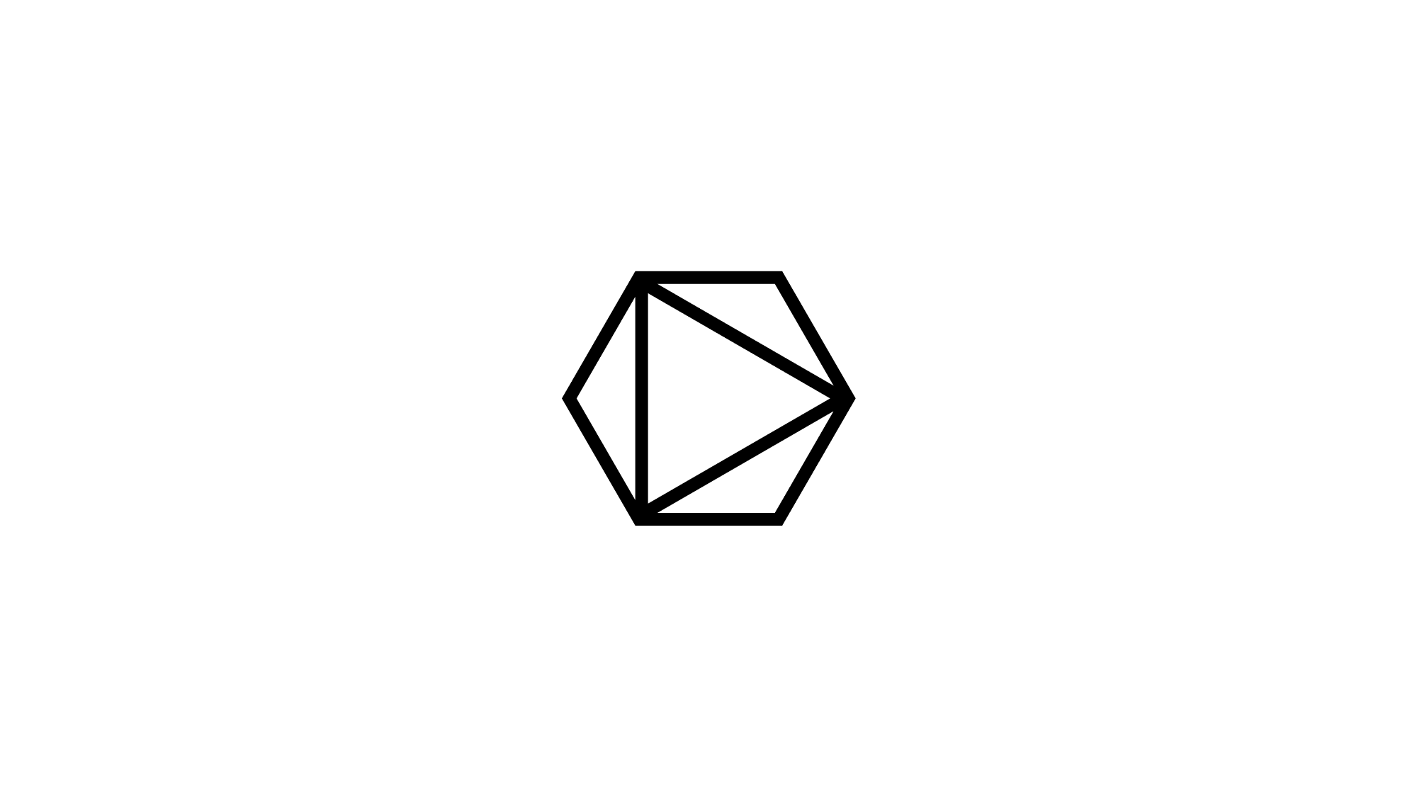
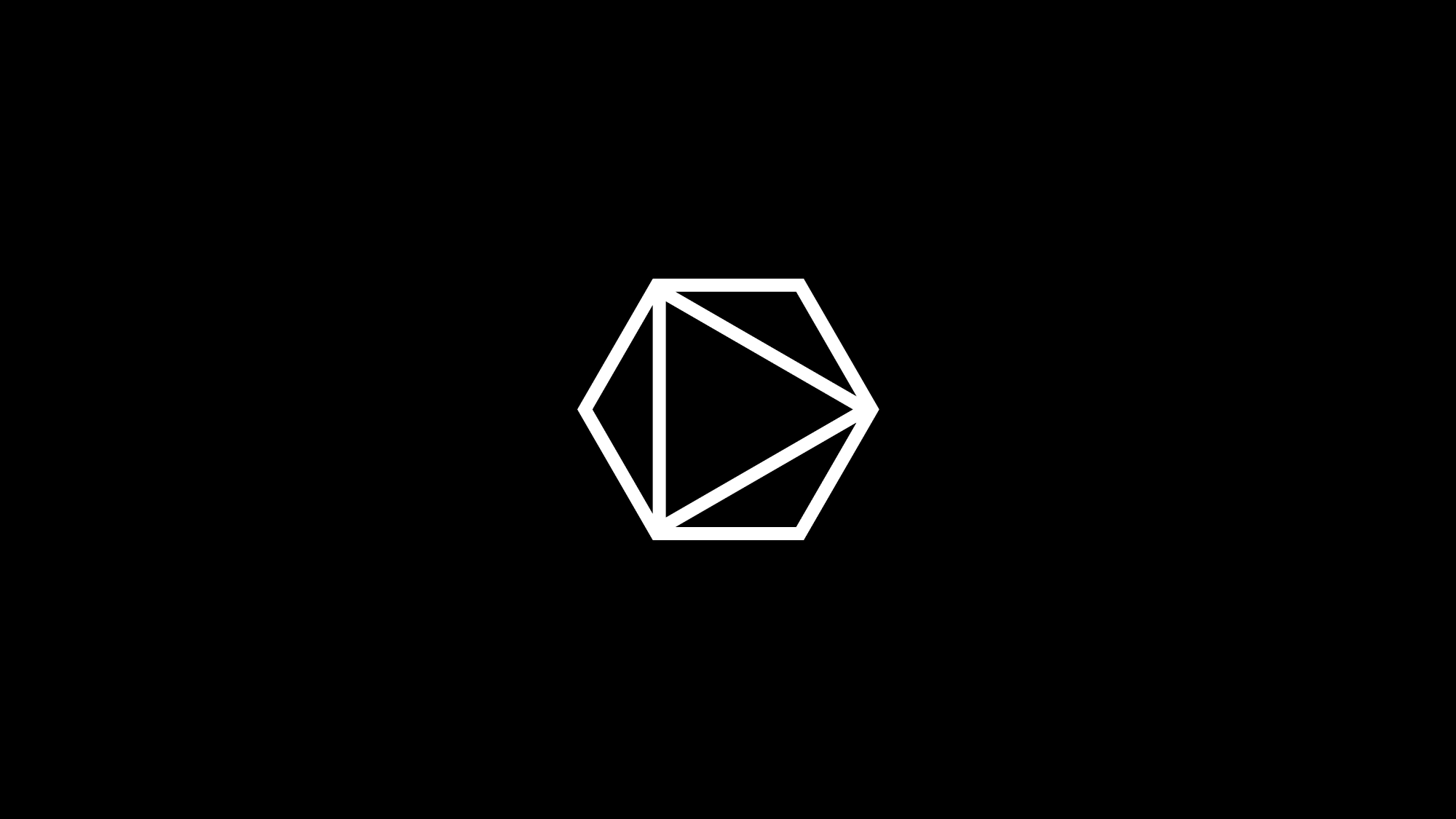
A combination of the primary letter, binary data transfer nodes/strings and input / output influences, the Linear M concept variants are simplified interpretations that focus on a clear monogram. Rounded edges, linear movement and the subtle inclusion of a classic ‘play’ icon help establish this variant as a minimal visual that works at almost any size and use case, and effective as an animation.
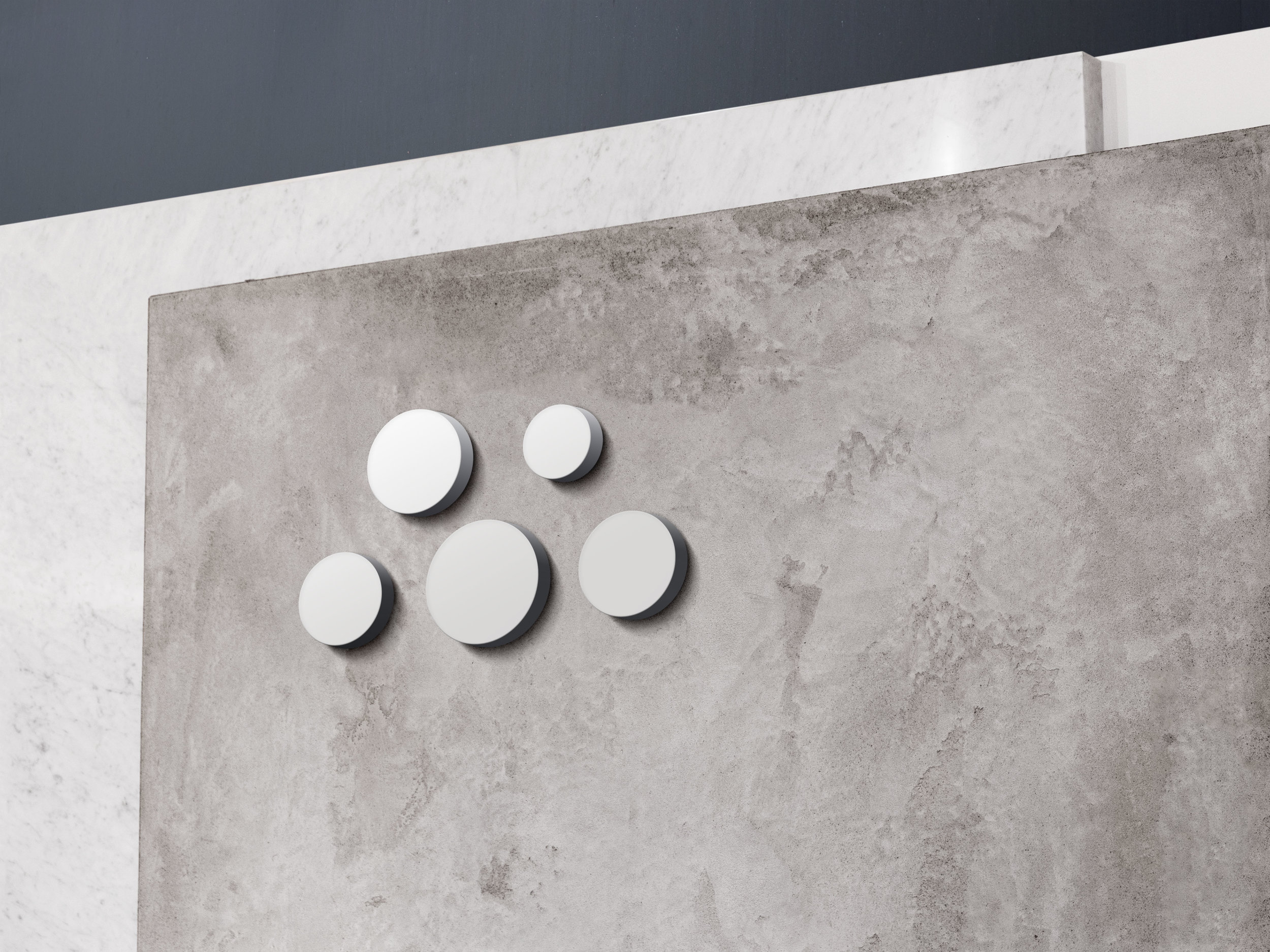
BINARY NODES
A linear interpretation of a binary tree as an M, this treatment evolved from a simple monogram into definitive ‘rigid’ and ‘organic’ variants.
Organic Binary M variants adhere to a grid alignment, but vary in all other aspects, creating a playful and slightly chaotic interpretation of previously rigid nodes. Stretching the limits of the letterform, the Organic variations also embody themes of movement and brightness, as though firing independently or within a series.
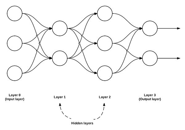
NEURAL NET
While working on the Binary Node concepts, I began exploring serious typographic treatments for the “MUSE.AI” company name. Beginning with character simplification, I experimented with the replacement of the E middle crossbar with a circle, sized to match both the . and the dot of the i. This concept spawned the idea of interaction between elements, forming nodes of their own amongst a new imaginary data stream, spanning first between the three circles (and eventually to all points of each letterform). An advantage of this full-length logo concept is that it also legibly includes the entire company name, not simply a monogram or a symbol, and could work as either a static image, visual signage, or animation.
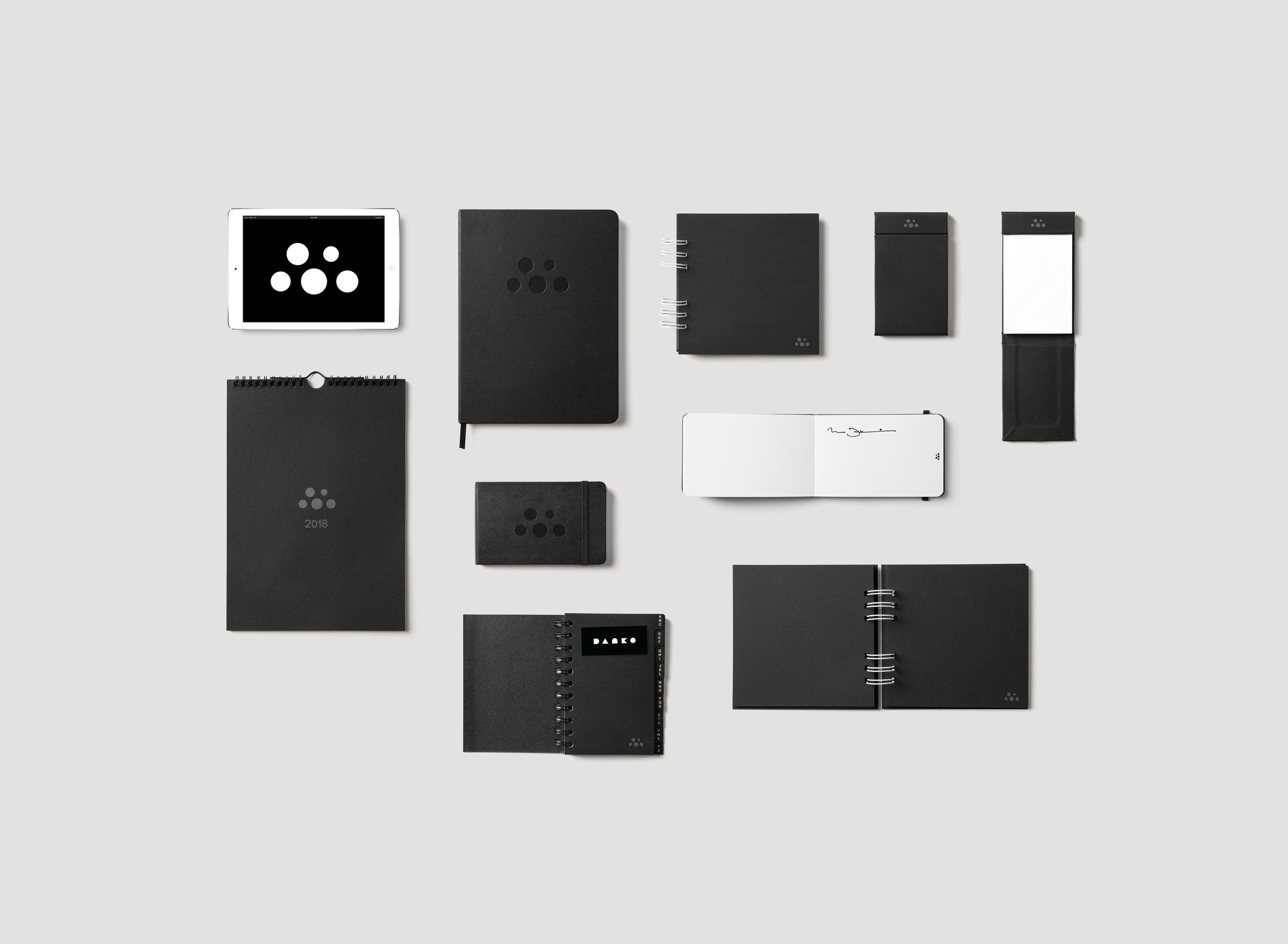
Refinement
During this four-day design process, three identity concepts matured into refinement, each based on the combination of binary nodes and the vizualisation of a neural net.
After constructive, collaborative feedback from the MUSE.Ai team, these selections seemed to most effectively resonate with the product, company and intent of the online video index AI service itself.
Of course, I animated them - to create a static identity would completely miss almost all visual opportunities inherent to the medium itself.


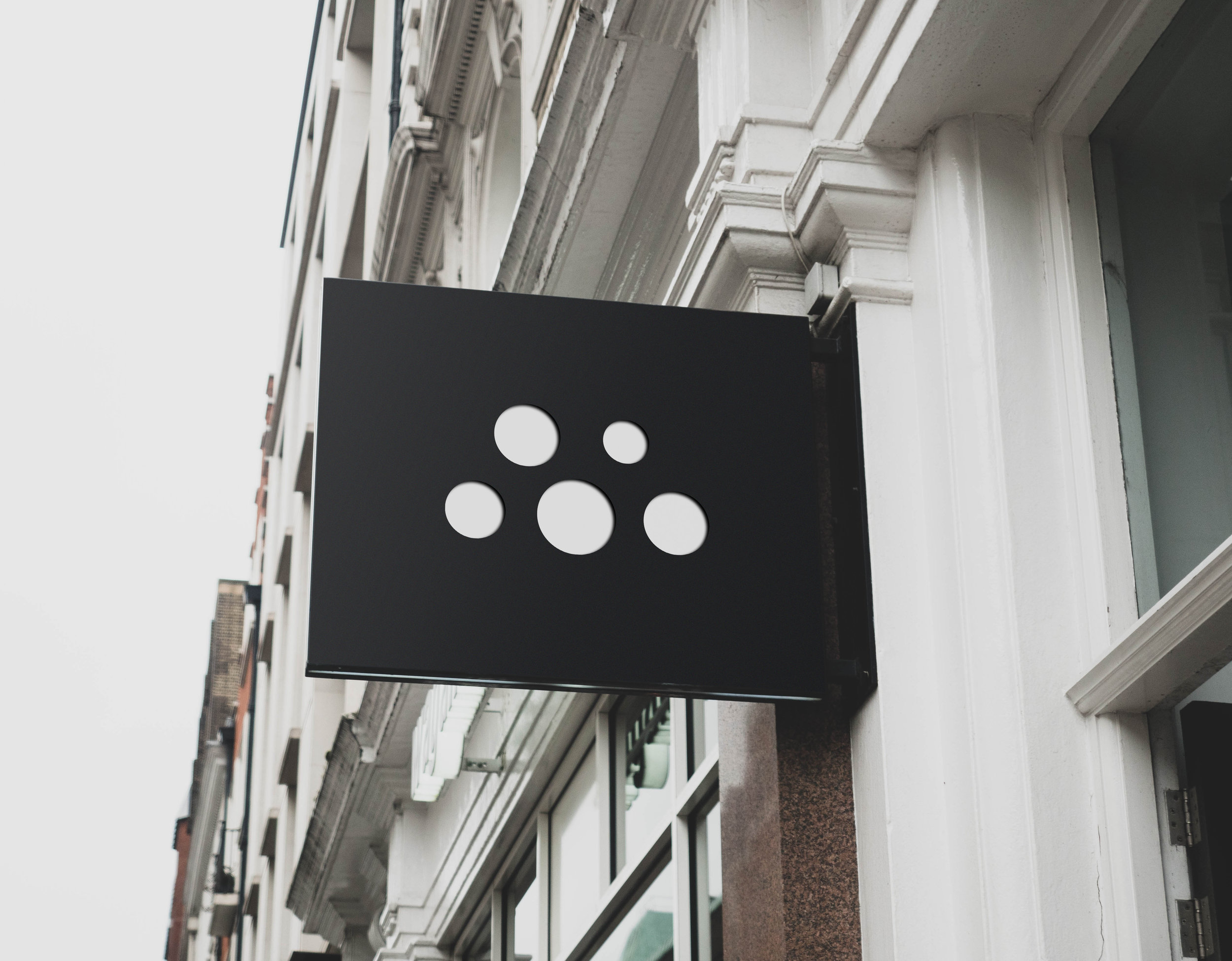
Final identity


APPLICATION