
B2P GREEN ENERGY FORUM IDENTITY Concept
Created by Matt Danko, January 2019
TASK: Research, concept, develop, and refine a communication platform visual identity design, then apply it as a homepage.
Define platform name
Design platform identity
Design the homepage
AUDIENCE: Public; intended for national B2P2B. Primary audience = European, all ages.
CONCEPT GOALS:
1. Bring companies and the people together to facilitate open exchange of ideas and resources regarding green energy,
2. Build a community platform where members can share their ideas (and collaborating companies can choose projects to support).
TIMELINE:
January 23rd - January 31st 2019
Research, sketches, word association, development, refinement and application of identity themes and ideas in traditional and digital mediums.
Web homepage visual/ui design based on refined identity concept.
SUMMARY:
This platform identity and homepage design was an exercise in creative problem solving and concept development.
Simplicity, accessibility, approachability and positive audience association were primary guides during the creative process.
PHASE 1: RESEARCH AND ASSOCIATION
After reviewing and analyzing the project Brief, I isolated keywords and began researching ideas, terms, information and imagery related to renewable energy and communication.
Core references and concepts included:
public communication mediums
kinetics + perpetual motion machines
cellular mitosis
renewable energy (biomass, geothermal, hydro, marine, solar and wind)
basic geometry


PHASE 2: EXPLORATION
NAME SELECTION
After completing initial research, I narrowed the name selection process down to three finalists, and began exploring platform identity ideas.
AGORA
(/ˈæɡərə/; Ancient Greek: ἀγορά agorá)
The agora was a central public space in ancient Greek city-states. The literal meaning of the word is "gathering place" or "assembly". The agora was the center of the athletic, artistic, spiritual and political life of the city.[1]
ROSTRA
(Italian: Rostri)
The Rostra was a large platform built in the city of Rome that stood during the republican and imperial periods.[2] Speakers would stand on the rostra and face the north side of the comitium towards the senate house and deliver orations to those assembled in between. Magistrates, politicians, advocates and other orators spoke to the assembled people of Rome from this highly honored, and elevated spot.[3]
GRÜNE BÜHNE
(German: Green Platform)
A literal translation of two primary elements of the design challenge, Grüne Bühne was an apt, fun, rhyming title option. As this project may be situated in Berlin or beyond, it also utilized appropriate language engagement.
idea exploration + ROugh visual concept sketchES
typography* & digital designS
*Given the modern/futuristic focus of the renewable energy identity platform, I consciously eliminated serif typefaces when choosing a typeface.


PHASE 3: REFINEMENT
After brainstorming, I chose two main themes to develop as platform identity visuals: Leaf and Spiro.
LEAF
Though cliché, the Green Leaf theme was an effective way to immediately recognise the environmental focus of the identity.


By using it to augment or replace characters within pre-selected titles, I tried to embed a leaf as an element of the platform identity itself, inseparable from the title. Sometimes this worked, but often it didn’t; I also tried to combine it with power/energy elements (visible within Phase 2), but focused on simplified expression instead.
Green was an obvious palette choice; I chose capital black letters as a clear, authoritative voice for the title. I used white as an open background, and combined it with ample clearspace to suggest open, positive, accessible and clear communication.
After experimenting with leaf direction, I decided that the psychology of the bottom-up/left-to-right orientation better indicated progress, growth and clarity. Other considerations included combining leaf veins with text message bubbles to emphasise communication, as well as symmetrical leaf halves, representing a mirrored two-way effort.


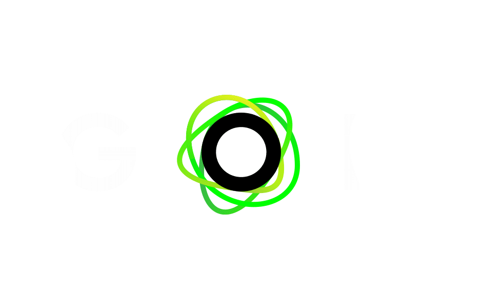
SPIRO
Easier to pronounce than ‘hypotrochoid’, the Spiro concept combined scientific and creative influences to create a simple, dynamic VISUAL.


Inspired by Roman column geometry, spirograph toys, optic light distribution, molecular dynamics, quantum physics, cellular photosynthesis and celestial orbit trajectories, the Spiro is an engaging focal point.
Comprised of a spectrum of greens, it represents nature, energy, communication, exchange, action, movement and urgency.
This combination evokes old and new, platform and action, monochrome and colour, form and shape, problem and solution.
An Intentionally chaotic scramble of pulsating curves, the Spiro maintains a perpetual loop behind the otherwise stoic black O of AGORA. Centered within the monochrome Greek platform name, the Spiro provides a spasm of kinetic energy to the identity, tempting curiousity, discussion attention without altering aesthetic balance.


PHASE 4: POLISH
Ultimately, I decided that the Leaf theme was too cliché, and opted instead to develop the Spiro concept + AGORA title as a final identity design for the renewable energy communication platform.
During Phase 4, I finalized logo and typography details, created additional Spiro .gif animations, then distilled design elements to use within the Homepage design.


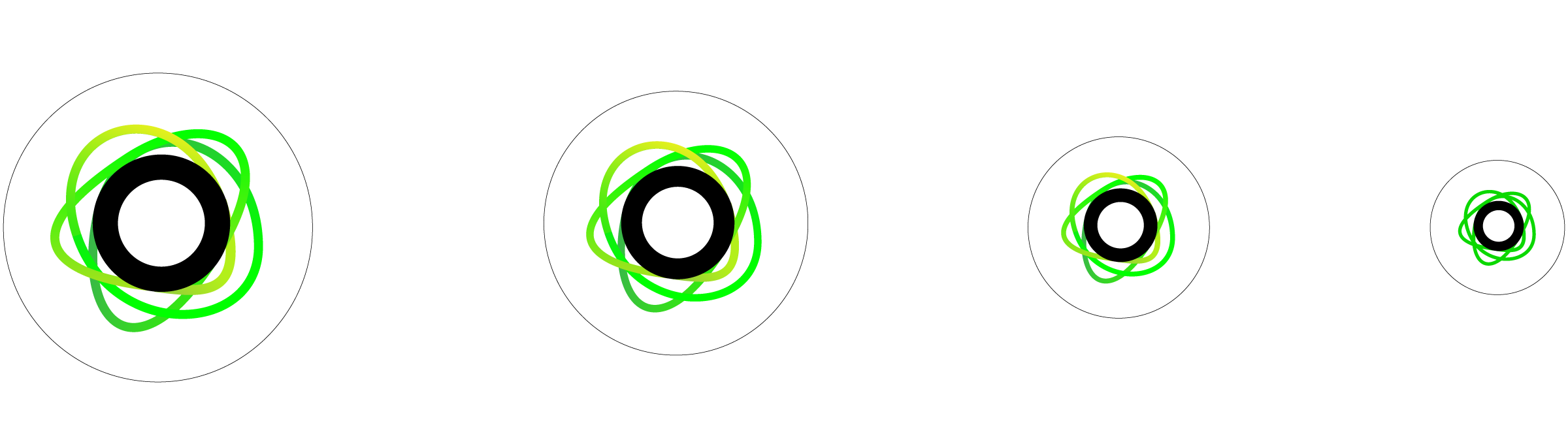

PHASE 5: BASIC HOMEPAGE CONCEPT
This simple AGORA homepage concept uses colours, visuals and design elements from the identity to introduce the brand, briefly define the initiative, engage users and provide information about events, meet-ups, projects and discussions.
Green values established within the Spiro design concept follow through into this layout, helping to emphasise content and CTA conventions. As the platform is intended to easily accessible to the public, I imagined it to be responsive, formatted to fit desktop, laptop, tablet and mobile screens.
DESKTOP
LAPTOP
TABLET
MOBILE
I created Ionic column capital line art accents for page separations (also used to differentiate phase sections within this presentation).
When appropriate, these Capitals are intended to briefly animate in a soundwave fashion, echoing the Spiro movement.


IN CONCLUSION
THE assignment WAS A Challenging creative EXERCISE to spark interest and invite discussion about a complicated, important global issue.
The task of conceiving and refining a modern B2P2B community-communication platform requires substantial respect, consideration and insight.
The AGORA brand design combines ancient communication, modern aesthetic and future energy initiatives to create a unique, vibrant, recognisable identity.
Engaging identity applications options could absolutely extend further into digital, experiential, web, print, event and beyond, further developing the animated O circle + vibrant Green Spiro elements.
Important lessons learned/emphasised during this assignment include:
When working alone, I require more time and iterations to effectively ideate. Though not possible for this project, I believe that I work best amongst a group of qualified, diverse and professional creatives… not unlike those of the Garage Team.
As always, A clear, detailed brief is absolutely essential for smooth project execution. support methods, timelines, tools and software support are absolutely pivotal for international design alignment and implementation.
No (wo)man is an island. A selection of contacts with diverse occupations, ages, education, background and interests contributed to my design process. By asking for and receiving critical feedback, I was able to recognize my own biases, validate/eliminate ideas and associations, and refine concepts toward completion,
